
#43267E Hex Color
Online color picker to view shades, tints, color codes, and complementary colors
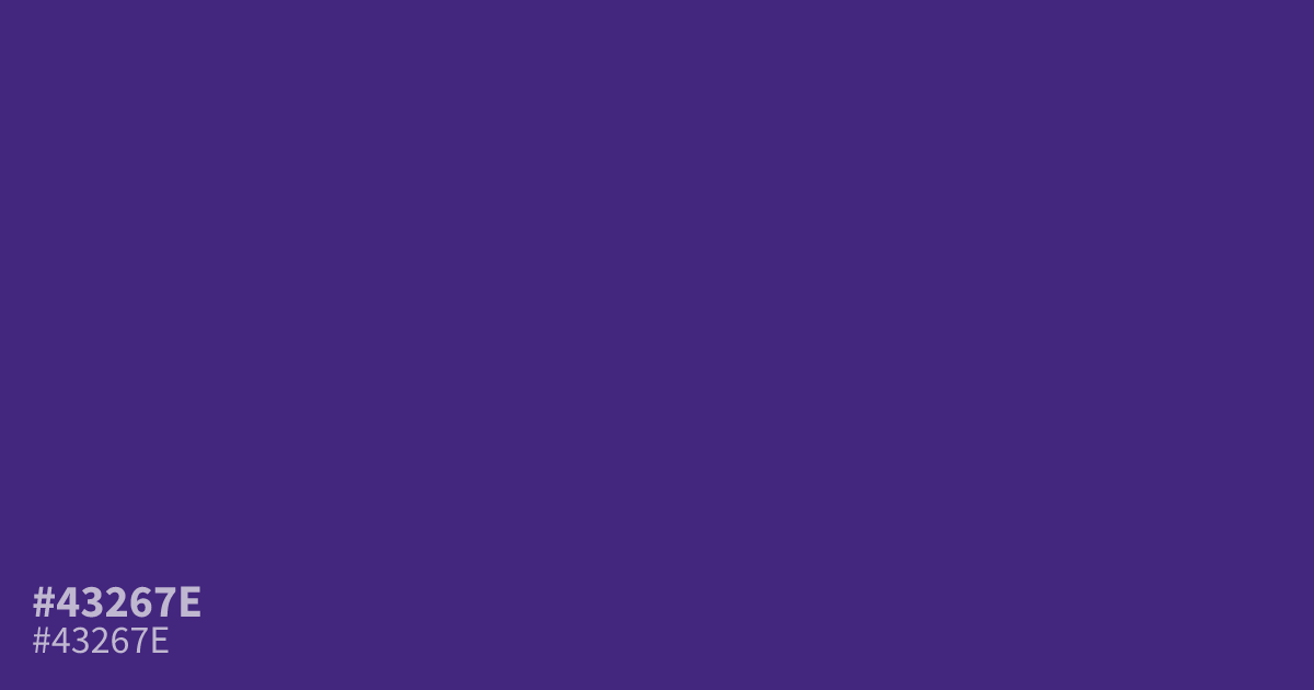
A rich and somber violet, #43267e holds significant weight for moody designs or high-contrast branding. This dark, saturated purple pairs well with metallic gold or stark white for a regal effect. Because of its intense depth, it works best as a primary background or a dominant feature color. The hex code for this serious tone is #43267e, which easily supports accessible white text.
Questions about #43267e
What is #43267e in RGB, HSL and CMYK?
In RGB, #43267e is rgb(67, 38, 126), in HSL hsl(260, 54%, 32%) and in CMYK 47%, 70%, 0%, 51%. Browse more shades of purple with names and hex codes.
Does #43267e work well for web text?
While #43267e serves well as a background or accent color, it is too dark for body text unless paired with pure white or very light pastels. Always run a contrast check to ensure your specific text size meets accessibility standards.
What colors complement #43267e for high-end design?
This intense violet pairs effectively with metallic gold or cream to create a sophisticated, regal aesthetic. For a more modern, high-contrast look, combine #43267e with crisp white or a soft, desaturated sage to balance its heavy, moody weight.
Is #43267e readable on white or black?
#43267e has a 11.55:1 contrast ratio on white and 1.81:1 on black. WCAG asks for 4.5:1 for body text and 3:1 for large text, so on white it works for body text and on black it is too faint for text. Try other pairs in the contrast checker.