
#432621 Hex Color
Online color picker to view shades, tints, color codes, and complementary colors
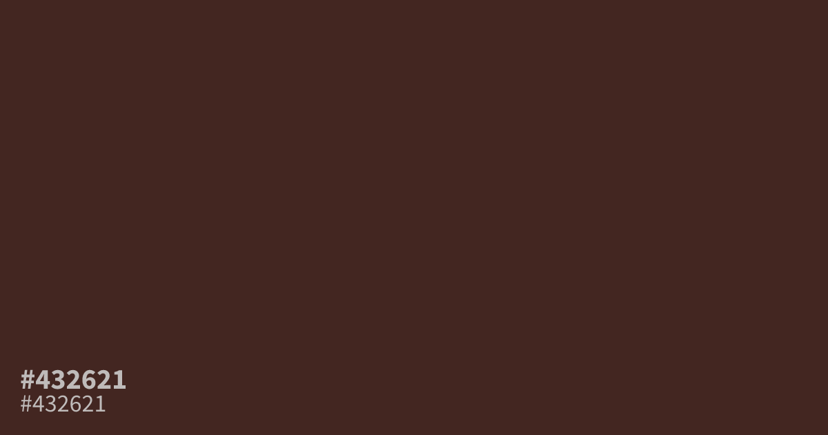
This dark, dusky red feels grounded and serious with its low saturation. Because #432621 is quite dim, it serves best as a moody background or a primary color in high-contrast palettes rather than for fine text. Pair it with soft creams or warm grays to avoid a muddy appearance. The hex code #432621 works well for conveying power and understated urgency in UI designs.
Questions about #432621
What is #432621 in RGB, HSL and CMYK?
In RGB, #432621 is rgb(67, 38, 33), in HSL hsl(9, 34%, 20%) and in CMYK 0%, 43%, 51%, 74%. Browse more shades of brown with names and hex codes.
How should I use #432621 in a UI design?
Use #432621 as a sophisticated, moody background or a primary accent color to convey weight and urgency. Because it is quite dim, avoid using it for small text or fine details that require high readability against dark surfaces.
What colors pair best with #432621?
Pair #432621 with cream or warm gray tones to prevent the palette from feeling muddy or overly dark. These lighter neutrals provide the necessary contrast to let the depth of this dusky red stand out effectively.
Is #432621 readable on white or black?
#432621 has a 13.65:1 contrast ratio on white and 1.53:1 on black. WCAG asks for 4.5:1 for body text and 3:1 for large text, so on white it works for body text and on black it is too faint for text. Try other pairs in the contrast checker.