
#422032 Hex Color
A moody dark plum with dusty undertones
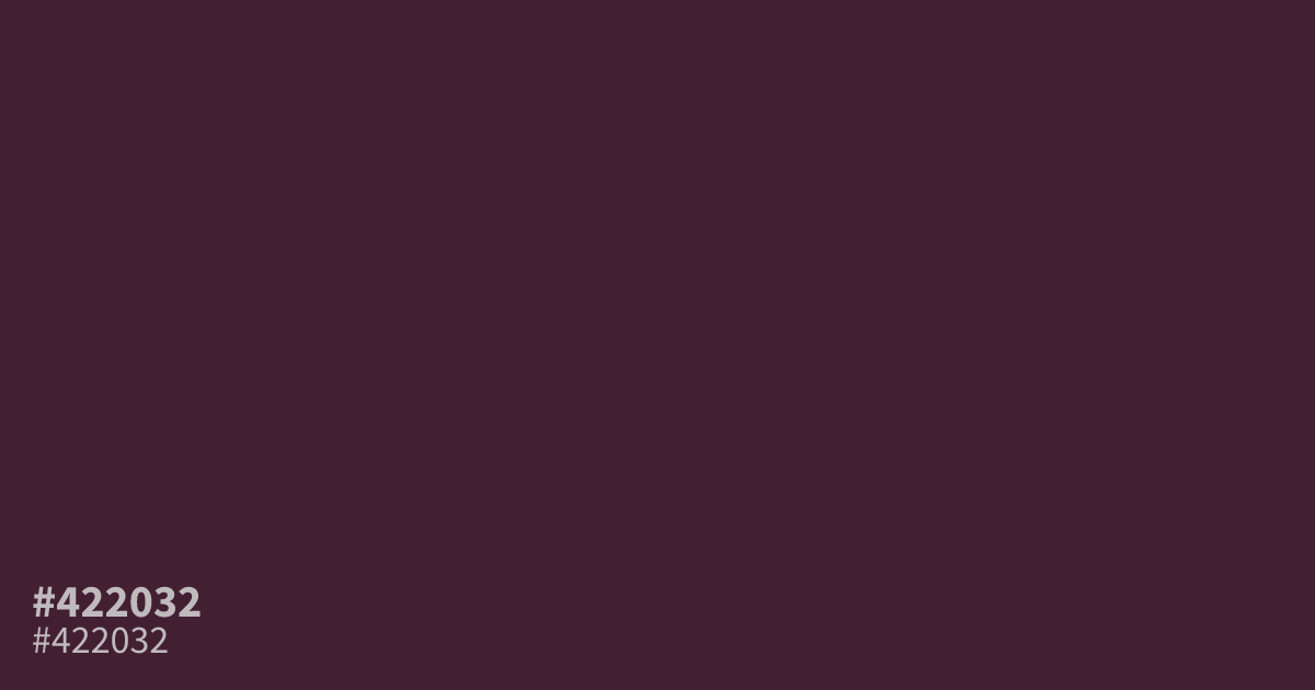
This dusty, dark plum brings a somber warmth to design work. As a muted pink with serious undertones, #422032 functions best as a base for moody palettes or as a sophisticated accent. White text remains highly readable against this hex code, making it a functional choice for dark mode UI. Avoid using it in small type, as the low saturation can cause it to appear muddy.
Questions about #422032
What is #422032 in RGB, HSL and CMYK?
In RGB, #422032 is rgb(66, 32, 50), in HSL hsl(328, 35%, 19%) and in CMYK 0%, 52%, 24%, 74%. Browse more shades of pink with names and hex codes.
Does #422032 work well for text on websites?
Yes, #422032 functions excellently as a dark background color because it provides enough contrast for white text to remain highly readable. Avoid using this hex code for small body text, however, as the muted saturation can make letterforms appear slightly muddy or illegible.
What colors pair best with #422032 for a balanced palette?
Pair #422032 with muted creams or soft beiges to create a sophisticated, high-contrast look without harshness. For a more dramatic combination, incorporate a bright gold or metallic accent to lift the somber, dusty plum tones.
Is #422032 readable on white or black?
#422032 has a 14.14:1 contrast ratio on white and 1.48:1 on black. WCAG asks for 4.5:1 for body text and 3:1 for large text, so on white it works for body text and on black it is too faint for text. Try other pairs in the contrast checker.