
#420B2B Hex Color
Online color picker to view shades, tints, color codes, and complementary colors
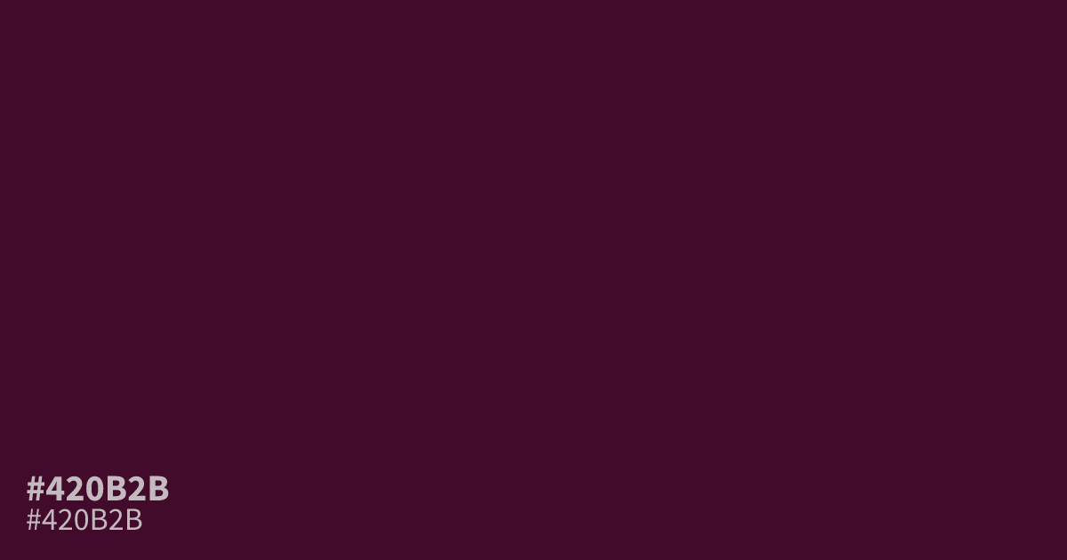
This deep, unsaturated plum-pink sits on the edge of darkness. Because #420b2b is so low in lightness, it works best as a moody, atmospheric background rather than large-scale text. Pair it with soft cream or muted gold to maintain legibility and warmth. This hex code provides excellent contrast for white UI elements, making it a solid choice for modern, high-contrast dark mode interfaces.
Questions about #420b2b
What is #420b2b in RGB, HSL and CMYK?
In RGB, #420b2b is rgb(66, 11, 43), in HSL hsl(325, 71%, 15%) and in CMYK 0%, 83%, 35%, 74%. Browse more shades of pink with names and hex codes.
What colors pair best with #420b2b?
Soft, creamy neutrals or muted golds work best to maintain legibility when paired with #420b2b. These warm, lighter shades prevent the deep plum from feeling too oppressive while balancing its heavy saturation in UI layouts.
Is #420b2b suitable for text usage?
Avoid using #420b2b for large-scale text or body copy, as its extreme darkness makes it difficult to read against most backgrounds. Instead, treat it as a background color or a deep accent that grounds brighter UI elements.
Is #420b2b readable on white or black?
#420b2b has a 15.97:1 contrast ratio on white and 1.31:1 on black. WCAG asks for 4.5:1 for body text and 3:1 for large text, so on white it works for body text and on black it is too faint for text. Try other pairs in the contrast checker.