
#412173 Hex Color
Online color picker to view shades, tints, color codes, and complementary colors
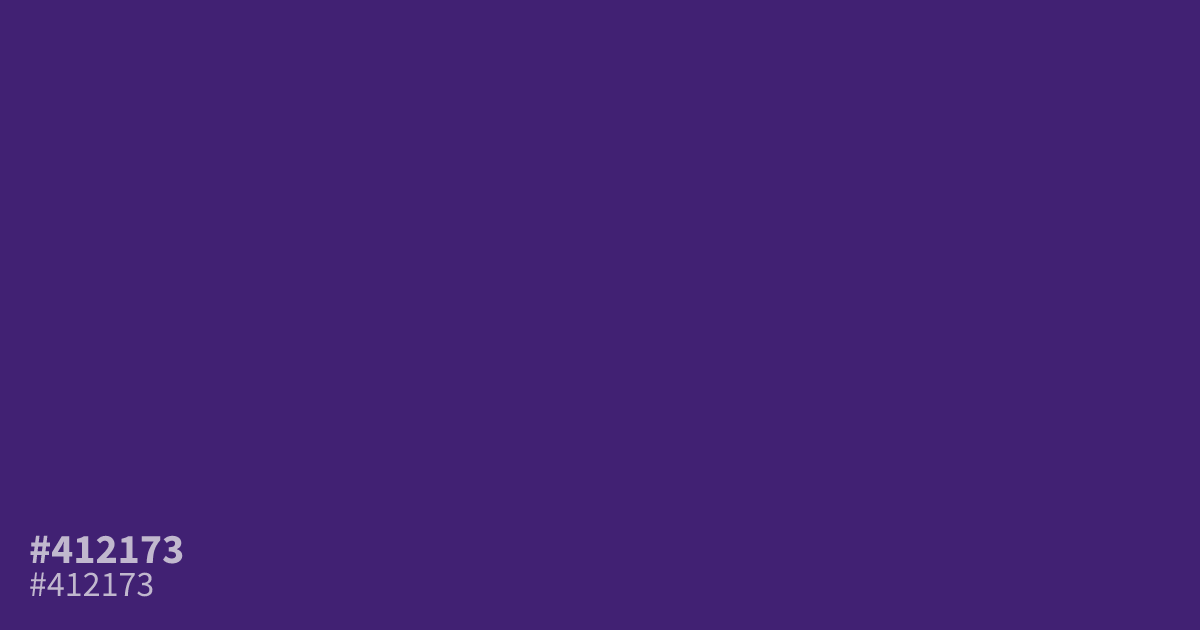
Dark and saturated, #412173 acts as a grounded, serious violet that anchors moody design palettes. Designers often choose this shade for dark UI backgrounds because it provides an excellent 12.4:1 contrast ratio against white text. Because it leans so dark, the color works best in larger blocks rather than fine details. This hex code pairs well with soft, muted gold accents.
Questions about #412173
What is #412173 in RGB, HSL and CMYK?
In RGB, #412173 is rgb(65, 33, 115), in HSL hsl(263, 55%, 29%) and in CMYK 43%, 71%, 0%, 55%. Browse more shades of purple with names and hex codes.
What colors pair best with #412173 in a design system?
This deep violet works exceptionally well when paired with soft, muted gold or warm metallics to provide visual balance. For neutral support, a light cream or off-white ensures the #412173 depth remains the focal point without overwhelming the layout.
Is #412173 suitable for text-heavy user interfaces?
#412173 provides an excellent 12.4:1 contrast ratio against white text, making it a reliable choice for dark mode applications. Because it is so saturated, ensure you use it in large blocks rather than fine lines or small UI icons.
Is #412173 readable on white or black?
#412173 has a 12.42:1 contrast ratio on white and 1.68:1 on black. WCAG asks for 4.5:1 for body text and 3:1 for large text, so on white it works for body text and on black it is too faint for text. Try other pairs in the contrast checker.