
#3D143E Hex Color
Deep plum shade with moody undertones
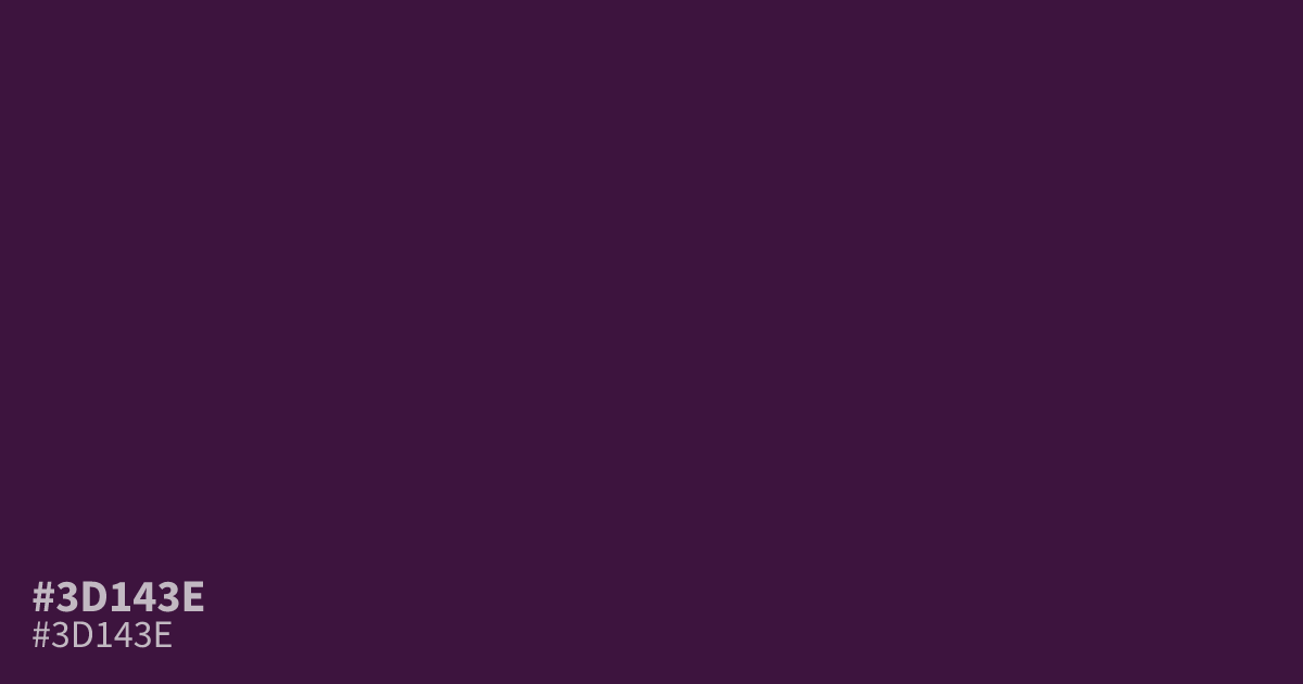
This dark, desaturated plum carries a moody, mysterious weight. The hex code #3d143e provides high contrast with white text, allowing for excellent readability in dark-mode interfaces. Use this shade as a primary background for luxury or nightlife branding rather than for small text elements. It pairs well with muted gold accents to add a touch of warmth to its cool, serious tone.
Questions about #3d143e
What is #3d143e in RGB, HSL and CMYK?
In RGB, #3d143e is rgb(61, 20, 62), in HSL hsl(299, 51%, 16%) and in CMYK 2%, 68%, 0%, 76%. Browse more shades of purple with names and hex codes.
How should I use #3d143e in UI design?
#3d143e works best as a primary background color for high-end or nightlife-focused interfaces because of its deep, moody saturation. Avoid using this hex color for small body text, as the dark value reduces legibility, and instead pair it with white or light, muted metallic accents.
What colors complement #3d143e effectively?
Muted gold or soft cream tones provide the necessary warmth to balance the cool, serious nature of #3d143e. These pairings add a sophisticated contrast that elevates the plum base without overwhelming the color's inherent dark, mysterious weight.
Is #3d143e readable on white or black?
#3d143e has a 15.35:1 contrast ratio on white and 1.36:1 on black. WCAG asks for 4.5:1 for body text and 3:1 for large text, so on white it works for body text and on black it is too faint for text. Try other pairs in the contrast checker.