
#3D0079 Hex Color
An intense, moody violet for high-contrast branding
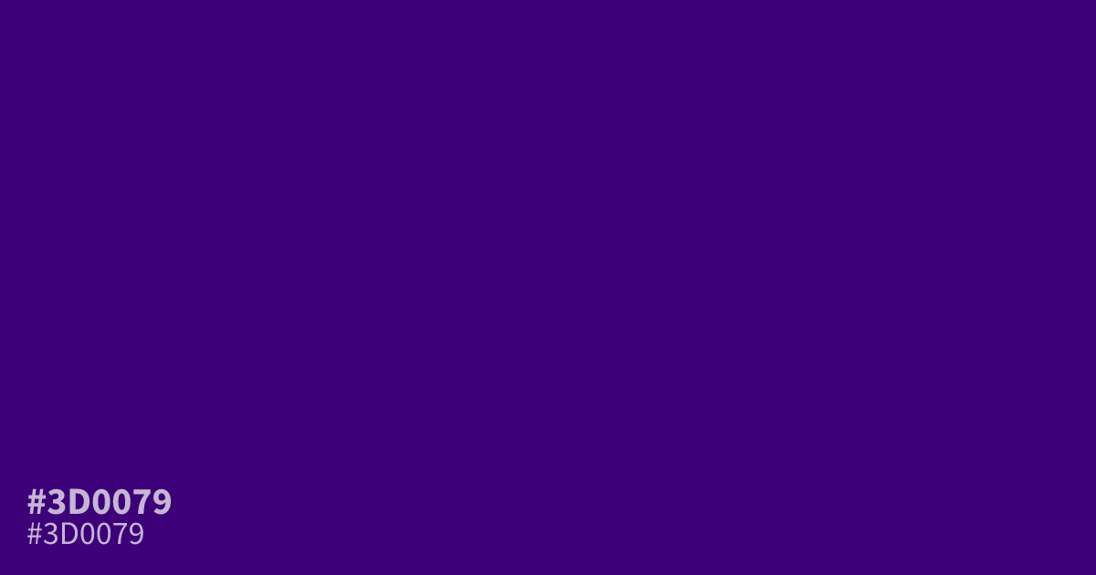
This intense, deep violet possesses a moody character suitable for dark mode interfaces or high-contrast branding. Because white text creates excellent legibility against it, the hex code #3d0079 works best as a primary background rather than an accent. Pair it with soft, muted grays instead of stark black to avoid creating a muddy, cluttered appearance in your designs.
Questions about #3d0079
What is #3d0079 in RGB, HSL and CMYK?
In RGB, #3d0079 is rgb(61, 0, 121), in HSL hsl(270, 100%, 24%) and in CMYK 50%, 100%, 0%, 53%. Browse more shades of purple with names and hex codes.
What colors pair best with the #3d0079 deep violet?
Pair #3d0079 with soft, desaturated neutrals like charcoal or cool silvers to maintain a sophisticated aesthetic. Avoid pairing it with pure black, as the lack of contrast can make the design appear muddy and difficult to read.
Is #3d0079 suitable for text on a web page?
Using #3d0079 as a text color is not recommended because its dark value provides insufficient contrast against standard light backgrounds. Instead, use this color as a bold primary background where white or high-contrast cream text remains legible and clear.
Is #3d0079 readable on white or black?
#3d0079 has a 14.24:1 contrast ratio on white and 1.47:1 on black. WCAG asks for 4.5:1 for body text and 3:1 for large text, so on white it works for body text and on black it is too faint for text. Try other pairs in the contrast checker.