
#3C3453 Hex Color
Online color picker to view shades, tints, color codes, and complementary colors
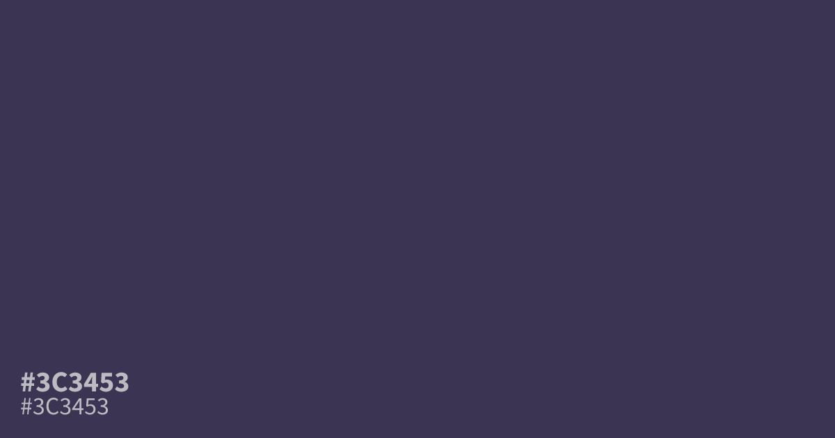
Dark purple, dimmed until it leans gray. #3c3453 reads gloomy and matte, better as a dark mode base or supporting tone than a bright accent. It flatters muted gold and dusty rose more than stark white. White text hits about 11.6:1 contrast on this hex code, so small body copy stays readable. Picture the result of mixing purple with a heavy dose of gray.
Questions about #3c3453
What is #3c3453 in RGB, HSL and CMYK?
In RGB, #3c3453 is rgb(60, 52, 83), in HSL hsl(255, 23%, 26%) and in CMYK 28%, 37%, 0%, 67%. Browse more shades of purple with names and hex codes.
What colors pair well with #3c3453?
Muted gold, dusty rose, and burgundy all bring out its depth without fighting it. For text, white is the safest pick, with about 11.6:1 contrast on top of #3c3453.
Does #3c3453 read warm or cool?
Cool. The blue channel leads the mix, so the violet carries a chill, ashy cast rather than a reddish warmth. That coolness is what keeps it feeling gloomy and calm.
Is #3c3453 readable on white or black?
#3c3453 has a 11.61:1 contrast ratio on white and 1.80:1 on black. WCAG asks for 4.5:1 for body text and 3:1 for large text, so on white it works for body text and on black it is too faint for text. Try other pairs in the contrast checker.