
#3C2C84 Hex Color
A moody violet with quiet depth
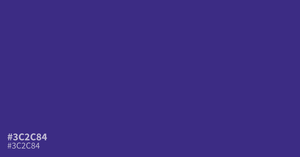
Dark and muted, #3c2c84 is a cool purple with rich violet undertones. Its serious, mysterious character suits luxury branding, spiritual projects, gaming interfaces, and moody backgrounds. Use the hex code #3c2c84 as a dominant base with pale lavender or warm cream accents. White text remains highly legible, with about an 11.1:1 contrast ratio.
Questions about #3c2c84
What is #3c2c84 in RGB, HSL and CMYK?
In RGB, #3c2c84 is rgb(60, 44, 132), in HSL hsl(251, 50%, 35%) and in CMYK 55%, 67%, 0%, 48%. Browse more shades of purple with names and hex codes.
What colors pair well with #3c2c84?
Pale lavender, warm cream, and charcoal pair well with #3c2c84, balancing its dark violet base with lighter, warmer, or tonal contrast while preserving its serious mood across interfaces and branding. Choose lavender for softness, cream for warmth, or charcoal for a restrained palette.
Is #3c2c84 a warm or cool color?
#3c2c84 reads as a cool color because its blue-violet balance outweighs its red component, giving the shade a deep purple appearance with restrained, slightly muted energy rather than bright saturated intensity. Pair it with warm cream or soft beige when the palette needs more approachability.
Where does #3c2c84 work best?
#3c2c84 works well as a dominant background or accent for luxury branding, spiritual projects, gaming interfaces, and moody editorial designs because its deep violet tone feels serious, mysterious, and polished rather than playful. Use pale lavender, cream, or white to create readable contrast.
Is #3c2c84 readable on white or black?
#3c2c84 has a 11.13:1 contrast ratio on white and 1.88:1 on black. WCAG asks for 4.5:1 for body text and 3:1 for large text, so on white it works for body text and on black it is too faint for text. Try other pairs in the contrast checker.