
#3B2822 Hex Color
Online color picker to view shades, tints, color codes, and complementary colors
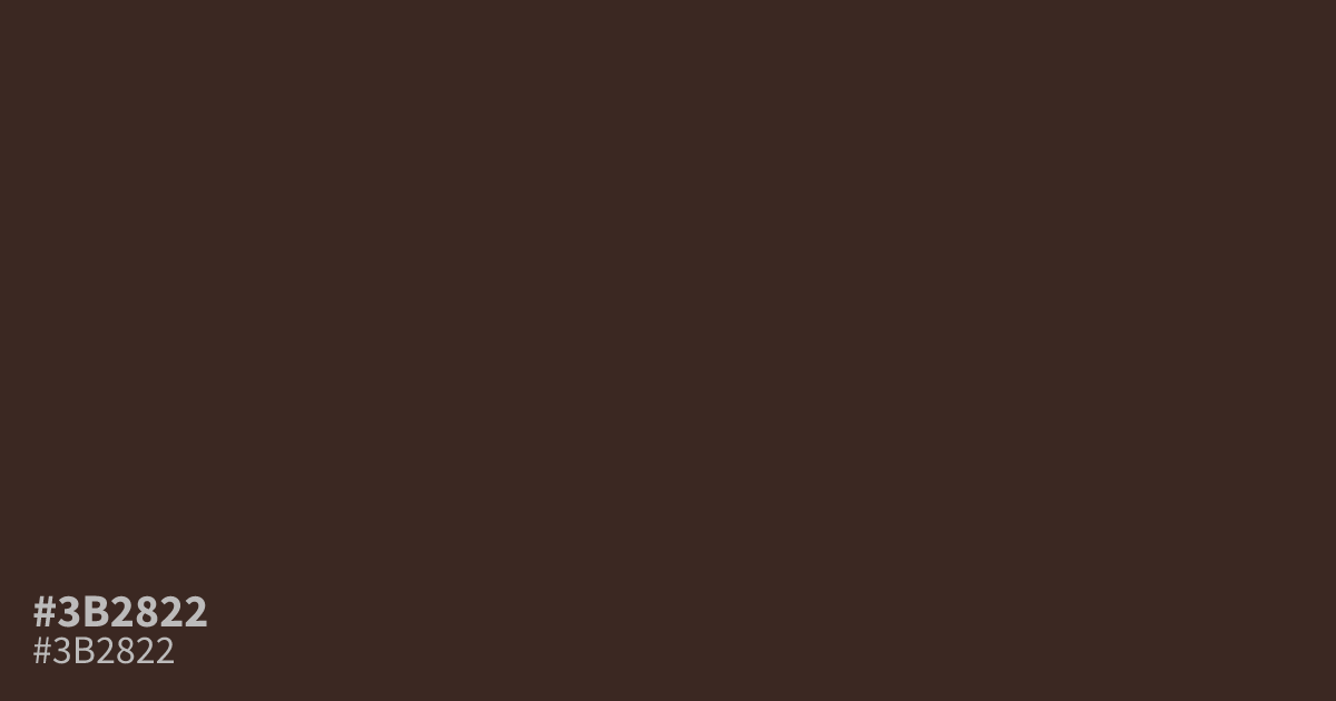
This dark, muted red sits close to black, feeling more like a dried, ashy clay than a vibrant pigment. Because it is so dim, #3b2822 works best as a moody, sophisticated background or for grounding heavy typography. It pairs cleanly with stark whites for high contrast, but use it sparingly; its low saturation can turn muddy if not balanced by brighter, cleaner accent colors.
Questions about #3b2822
What is #3b2822 in RGB, HSL and CMYK?
In RGB, #3b2822 is rgb(59, 40, 34), in HSL hsl(14, 27%, 18%) and in CMYK 0%, 32%, 42%, 77%. Browse more shades of black with names and hex codes.
How can #3b2822 be used in design without looking muddy?
Use #3b2822 as a grounding element for heavy typography or dark backgrounds, but pair it with high-contrast, clean neutrals like off-white or cream to keep it from feeling flat. The secret is letting the light colors dominate the negative space so this dark red serves as an anchor rather than a heavy void.
What psychological effect does #3b2822 convey?
This color communicates a sense of organic, rustic sophistication due to its ashy, clay-like appearance. It feels grounded and serious, making it an excellent choice for luxury branding or editorial design that requires a quiet, refined authority instead of a loud, attention-grabbing hue.
Is #3b2822 readable on white or black?
#3b2822 has a 13.88:1 contrast ratio on white and 1.51:1 on black. WCAG asks for 4.5:1 for body text and 3:1 for large text, so on white it works for body text and on black it is too faint for text. Try other pairs in the contrast checker.