
#3A3042 Hex Color
Online color picker to view shades, tints, color codes, and complementary colors
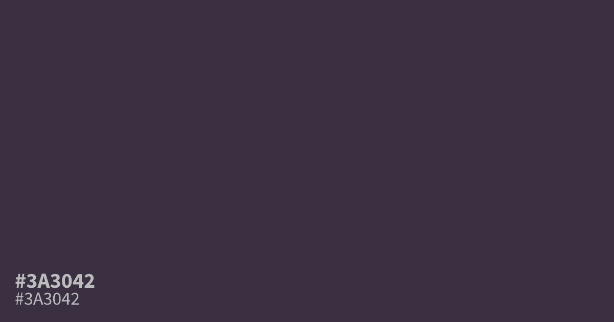
This dusty, muted violet reads as a sophisticated dark neutral. Because of its low chroma and heavy gray undertone, #3a3042 works best as a moody background color for dark interfaces. It offers high contrast for white text, ensuring excellent readability. Pair it with muted gold accents for a premium feel, but avoid using it in small type, where its darkness can make details disappear.
Questions about #3a3042
What is #3a3042 in RGB, HSL and CMYK?
In RGB, #3a3042 is rgb(58, 48, 66), in HSL hsl(273, 16%, 22%) and in CMYK 12%, 27%, 0%, 74%. Browse more shades of black with names and hex codes.
Does #3a3042 read as warm or cool?
#3a3042 sits on the cooler side of the spectrum due to its strong gray and violet base. While it has some depth that prevents it from appearing icy, it lacks the red or yellow warmth required to feel truly inviting.
What colors pair well with #3a3042?
Is #3a3042 readable on white or black?
#3a3042 has a 12.48:1 contrast ratio on white and 1.68:1 on black. WCAG asks for 4.5:1 for body text and 3:1 for large text, so on white it works for body text and on black it is too faint for text. Try other pairs in the contrast checker.