
#3A2B7C Hex Color
Online color picker to view shades, tints, color codes, and complementary colors
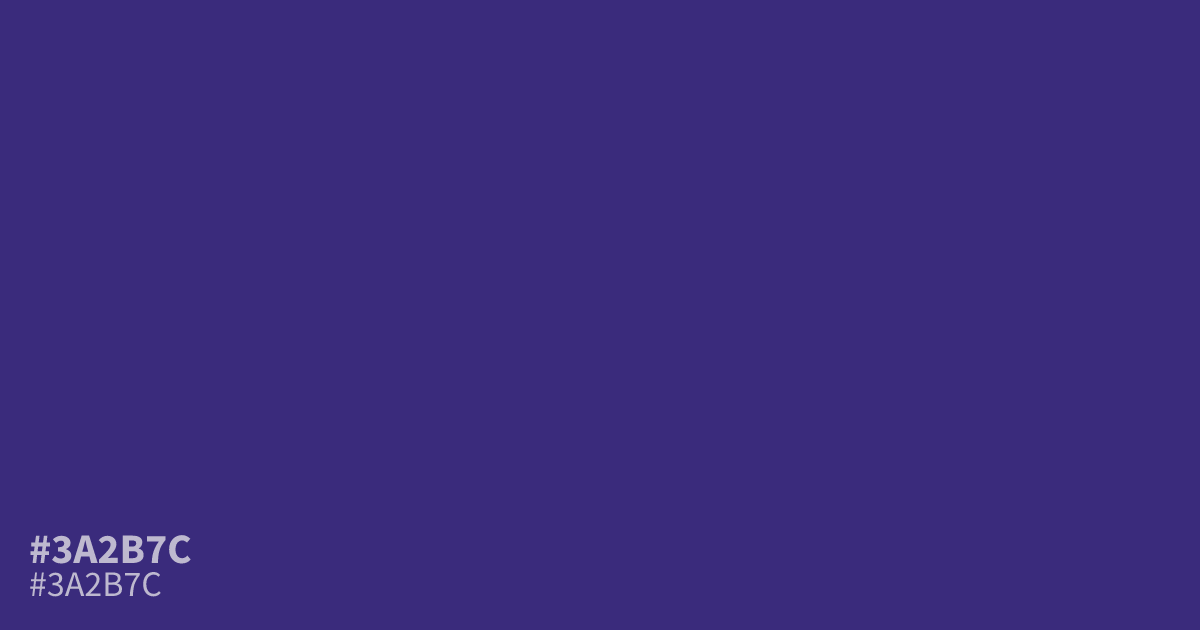
Deep violet with a muted, shadowed cast. #3a2b7c is dark and low in saturation, so it works best as a dominant base in dark mode UI or moody brand palettes. White text hits about 11.6:1 contrast, clearing AA for body copy. Pair it with burnt gold or dusty rose to lift the gloom. Next to bright purples, it can read muddy.
Questions about #3a2b7c
What is #3a2b7c in RGB, HSL and CMYK?
In RGB, #3a2b7c is rgb(58, 43, 124), in HSL hsl(251, 49%, 33%) and in CMYK 53%, 65%, 0%, 51%. Browse more shades of purple with names and hex codes.
What text color works best on #3a2b7c?
White text works best, reaching about 11.6:1 contrast, well above the WCAG AA minimum of 4.5:1 for body copy. Black text falls short on this dark shade, so keep type light.
What colors pair well with #3a2b7c?
Muted golds and dusty rose lift its gloomy tone, while burgundy deepens it for luxury or wine themes. Bright purples tend to make it look muddy by comparison.
Is #3a2b7c readable on white or black?
#3a2b7c has a 11.56:1 contrast ratio on white and 1.81:1 on black. WCAG asks for 4.5:1 for body text and 3:1 for large text, so on white it works for body text and on black it is too faint for text. Try other pairs in the contrast checker.