
#397552 Hex Color
Online color picker to view shades, tints, color codes, and complementary colors
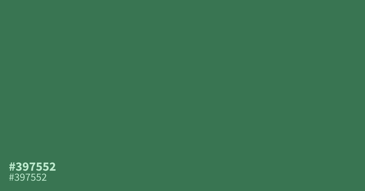
Muted and moderately dark, #397552 is an unsaturated green with subtle blue-gray undertones. Its steady, grounded character suits sustainability, organic goods, pharmacy, finance, and gardening brands. Use it as a supporting tone beside warm cream or muted clay, or as a UI background with white text, which reaches about 5.5:1 contrast. The hex code for this green is #397552.
Questions about #397552
What is #397552 in RGB, HSL and CMYK?
In RGB, #397552 is rgb(57, 117, 82), in HSL hsl(145, 34%, 34%) and in CMYK 51%, 0%, 30%, 54%. Browse more shades of green with names and hex codes.
Which colors pair well with #397552?
Warm cream and muted clay pair well with #397552, balancing its cool blue-gray undertone with softer warmth; terracotta can add contrast without overwhelming its grounded, natural character in restrained, nature-inspired layouts. Use cream for airy backgrounds and clay or terracotta for smaller accents.
Does #397552 feel warm or cool?
#397552 reads as a cool-leaning green because its muted hue carries subtle blue-gray undertones, while its low saturation keeps the effect calm rather than icy in interfaces and natural-toned branding. It can still sit comfortably beside warmer neutrals.
Does #397552 work with white text?
White text on #397552 reaches about a 5.5:1 contrast ratio, meeting WCAG AA for normal-sized text but falling short of the 7:1 AAA threshold, so verify text size and weight in the final interface.
Where does #397552 work well in a design?
#397552 works well as a supporting tone for sustainability, organic goods, pharmacy, finance, and gardening brands, as well as UI backgrounds where white text needs a readable, moderately dark green.
Is #397552 readable on white or black?
#397552 has a 5.46:1 contrast ratio on white and 3.84:1 on black. WCAG asks for 4.5:1 for body text and 3:1 for large text, so on white it works for body text and on black it works only for large text (24px, or 18.5px bold). Try other pairs in the contrast checker.