
#390D71 Hex Color
Online color picker to view shades, tints, color codes, and complementary colors
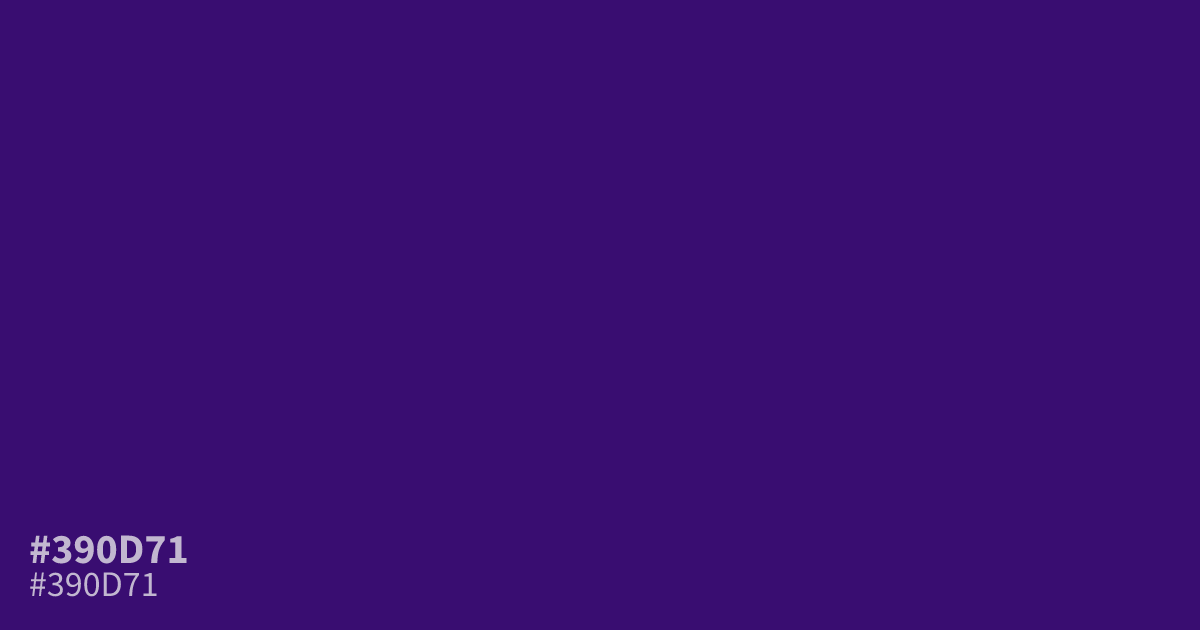
#390d71 is a deep, saturated violet with a dim, moody character. It serves well as a base for dark mode interfaces. White text offers excellent readability against this hue, boasting a high 14.3:1 contrast ratio. Pair this color with soft, warm metallics to balance its inherent coolness. The hex code is #390d71.
Questions about #390d71
What is #390d71 in RGB, HSL and CMYK?
In RGB, #390d71 is rgb(57, 13, 113), in HSL hsl(266, 79%, 25%) and in CMYK 50%, 88%, 0%, 56%. Browse more shades of purple with names and hex codes.
How does #390d71 perform in UI design?
#390d71 provides excellent readability for white text, boasting a high 14.3:1 contrast ratio that ensures accessibility. It serves as an ideal base for dark mode interfaces because its deep, saturated tone reduces eye strain while maintaining a strong visual presence.
What colors pair well with #390d71?
Is #390d71 readable on white or black?
#390d71 has a 14.28:1 contrast ratio on white and 1.46:1 on black. WCAG asks for 4.5:1 for body text and 3:1 for large text, so on white it works for body text and on black it is too faint for text. Try other pairs in the contrast checker.