
#382F71 Hex Color
Online color picker to view shades, tints, color codes, and complementary colors
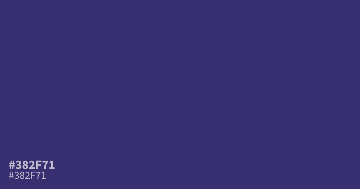
Deep, dusty violet with a muted gray undertone. #382f71 works best as a dark base or supporting tone, giving moody designs structure without the loudness of brighter purples. Pair it with muted gold or dusty rose for warmth. White text on this hex code reaches about 11.6:1 contrast, so small body copy stays readable.
Questions about #382f71
What is #382f71 in RGB, HSL and CMYK?
In RGB, #382f71 is rgb(56, 47, 113), in HSL hsl(248, 41%, 31%) and in CMYK 50%, 58%, 0%, 56%. Browse more shades of purple with names and hex codes.
What colors pair well with #382f71?
Muted gold, dusty rose, and warm ochre all lift this dark violet and keep it from reading flat. For a cooler palette, try slate blue or soft lavender as lighter supporting tones.
Is #382f71 a good background color for text?
Yes. White text on #382f71 reaches about 11.6:1 contrast, well above the 4.5:1 minimum for WCAG AA body text. Light gray text also works, but check anything below 4.5:1 before committing.
What mood does #382f71 convey?
It reads serious and subdued, closer to midnight than to bright purple. The low saturation keeps it calm and understated, which suits luxury branding, spiritual themes, and moody gaming interfaces.
Is #382f71 readable on white or black?
#382f71 has a 11.58:1 contrast ratio on white and 1.81:1 on black. WCAG asks for 4.5:1 for body text and 3:1 for large text, so on white it works for body text and on black it is too faint for text. Try other pairs in the contrast checker.