
#381629 Hex Color
Online color picker to view shades, tints, color codes, and complementary colors
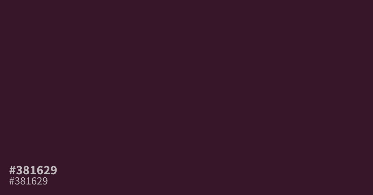
This extremely dark, desaturated shade of plum feels grounded and moody. Because #381629 is so low in brightness, it serves best as a dominant background color in dark mode interfaces or as a moody accent. Avoid using it for fine text. It pairs well with soft, muted gold or cream accents, which lift the color and provide a sophisticated contrast.
Questions about #381629
What is #381629 in RGB, HSL and CMYK?
In RGB, #381629 is rgb(56, 22, 41), in HSL hsl(326, 44%, 15%) and in CMYK 0%, 61%, 27%, 78%. Browse more shades of pink with names and hex codes.
How should I use #381629 in my design projects?
#381629 functions best as a dominant dark background or a dramatic accent piece. Because it is so dark and low in brightness, avoid using it for small or fine text as it will lack the necessary contrast for comfortable reading.
What colors pair well with #381629?
Is #381629 readable on white or black?
#381629 has a 15.97:1 contrast ratio on white and 1.31:1 on black. WCAG asks for 4.5:1 for body text and 3:1 for large text, so on white it works for body text and on black it is too faint for text. Try other pairs in the contrast checker.