
#372E1E Hex Color
Online color picker to view shades, tints, color codes, and complementary colors
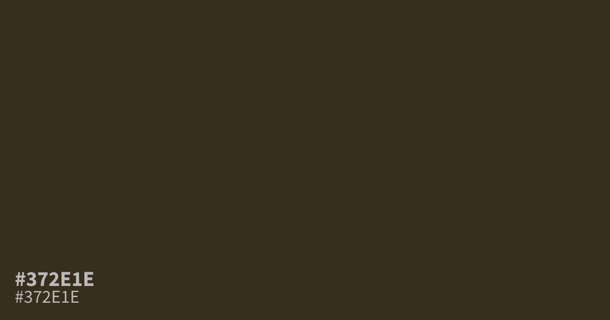
This murky, near-black olive is muted and serious. Because of its intense depth, #372e1e works well as a grounding neutral for moody, low-contrast interfaces rather than as a primary color. It creates strong readability when paired with white text, offering a sophisticated alternative to standard charcoal. Avoid using it in large blocks if you want to keep your layout from feeling too heavy or closed in.
Questions about #372e1e
What is #372e1e in RGB, HSL and CMYK?
In RGB, #372e1e is rgb(55, 46, 30), in HSL hsl(38, 29%, 17%) and in CMYK 0%, 16%, 45%, 78%. Browse more shades of black with names and hex codes.
How can I use #372e1e effectively in UI design?
#372e1e works best as a grounding neutral for sophisticated, low-contrast interfaces rather than a primary color. Because it is so deep, pair it with crisp white text or lighter beige accents to maintain readability and prevent the layout from feeling too enclosed.
What colors pair well with #372e1e?
This deep, murky olive pairs naturally with soft, desaturated neutrals like cream or warm gray to balance its heavy, organic feel. You can also introduce small pops of muted terracotta for a subtle, earthy contrast that highlights the olive undertones.
Is #372e1e readable on white or black?
#372e1e has a 13.35:1 contrast ratio on white and 1.57:1 on black. WCAG asks for 4.5:1 for body text and 3:1 for large text, so on white it works for body text and on black it is too faint for text. Try other pairs in the contrast checker.