
#362548 Hex Color
Online color picker to view shades, tints, color codes, and complementary colors
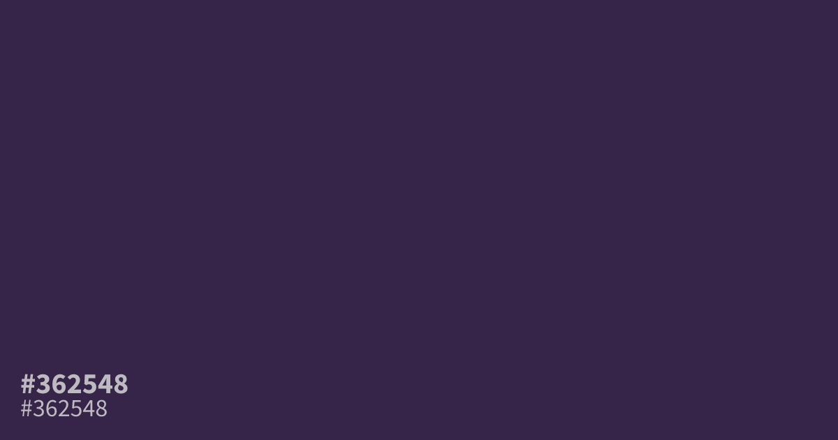
Don’t expect brightness from this one. #362548 is a dark, ashy purple with barely any saturation, closer to ink than grape. That muted weight makes it a solid base for moody interfaces and luxury branding, where a brighter violet would shout. It reads cooler than warm. Pair it with muted gold or dusty rose, and let white text carry fine print: contrast hits about 13.9:1, comfortably past WCAG AA.
Questions about #362548
What is #362548 in RGB, HSL and CMYK?
In RGB, #362548 is rgb(54, 37, 72), in HSL hsl(269, 32%, 21%) and in CMYK 25%, 49%, 0%, 72%. Browse more shades of purple with names and hex codes.
What colors pair well with #362548?
Muted gold and dusty rose flatter #362548 better than obvious pastels, because both match its low saturation. For contrast, soft cream or warm gray text keeps palettes calm and readable.
Does #362548 read warm or cool?
It reads cool. The low lightness and near-absent saturation give it an inky, shadowed character, so it suits moody interfaces, dark mode themes, and luxury branding.
Is #362548 readable on white or black?
#362548 has a 13.86:1 contrast ratio on white and 1.51:1 on black. WCAG asks for 4.5:1 for body text and 3:1 for large text, so on white it works for body text and on black it is too faint for text. Try other pairs in the contrast checker.