
#352F51 Hex Color
Online color picker to view shades, tints, color codes, and complementary colors
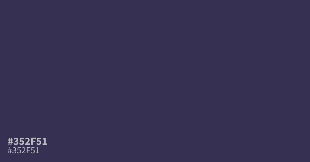
A dark, muted violet with cool gray undertones, #352f51 feels serious, mysterious, and structured rather than vivid. Its low saturation suits moody interfaces, spiritual branding, and refined gaming or luxury palettes. Use it as a dominant background with white text, which reaches about 12.5:1 contrast, and add dusty rose or antique gold for restrained warmth. The hex code is #352f51.
Questions about #352f51
What is #352f51 in RGB, HSL and CMYK?
In RGB, #352f51 is rgb(53, 47, 81), in HSL hsl(251, 27%, 25%) and in CMYK 35%, 42%, 0%, 68%. Browse more shades of purple with names and hex codes.
What colors pair well with #352f51?
Dusty rose and antique gold add restrained warmth to #352f51, while white provides a crisp, high-contrast accent; use these combinations to soften its cool, serious base without making the palette bright or overly playful.
Does #352f51 read as a warm or cool color?
#352f51 reads as a cool color because its violet hue is balanced by gray undertones, its saturation is restrained, and it lacks the warm yellow or orange cast found in many earthy shades. That combination gives it a serious, mysterious feel suited to focused interfaces, spiritual themes, and refined dark palettes.
Where can #352f51 work well in design?
Use #352f51 for dark interface backgrounds, headers, cards, spiritual branding, or refined gaming visuals where its muted violet creates depth without the energy or visual noise of a vivid purple.
Is #352f51 readable on white or black?
#352f51 has a 12.52:1 contrast ratio on white and 1.67:1 on black. WCAG asks for 4.5:1 for body text and 3:1 for large text, so on white it works for body text and on black it is too faint for text. Try other pairs in the contrast checker.