
#352F2C Hex Color
A moody, dusky neutral with gray depth
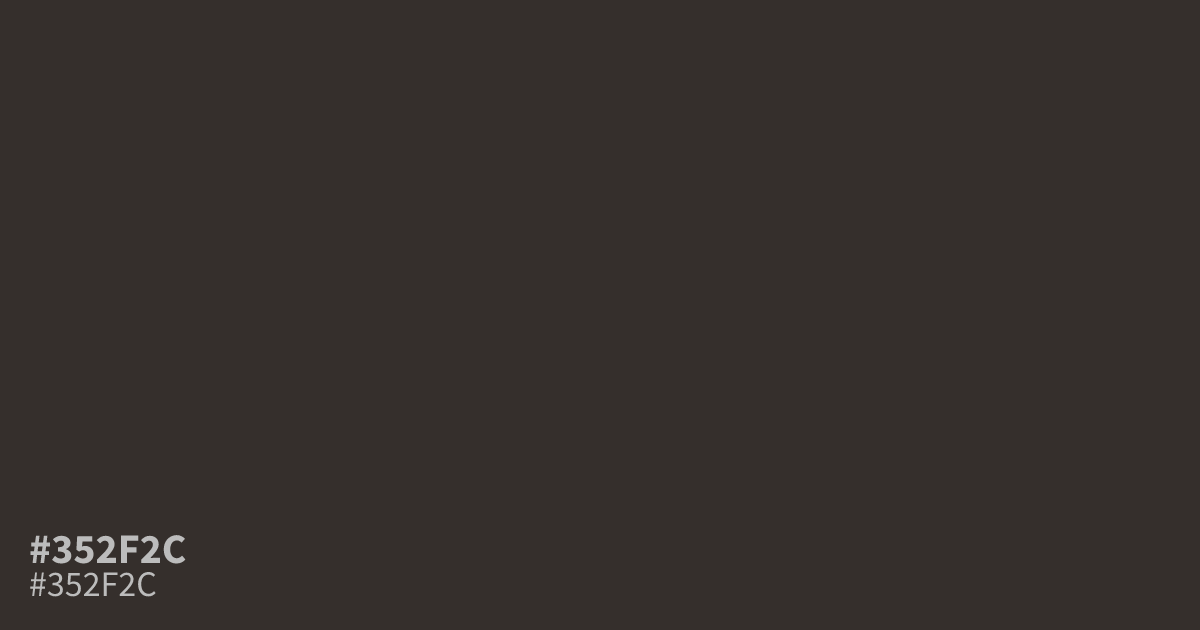
This dark, dusky shade acts as a reliable, muted neutral with strong gray undertones. Because #352f2c sits so low on the lightness scale, it serves best as a moody background or a primary grounding element in branding. White text is highly readable against this hex code, making it a functional choice for dark mode layouts or minimalist packaging designs that require serious, understated depth.
Questions about #352f2c
What is #352f2c in RGB, HSL and CMYK?
In RGB, #352f2c is rgb(53, 47, 44), in HSL hsl(20, 9%, 19%) and in CMYK 0%, 11%, 17%, 79%. Browse more shades of black with names and hex codes.
Where should I use #352f2c in a web design?
#352f2c works best as a primary background or grounding element when you need serious depth without using pure black. It provides a softer, more organic aesthetic for text-heavy layouts while maintaining excellent readability when paired with white or off-white typography.
What colors pair well with #352f2c?
Because #352f2c functions as a dark neutral, it pairs beautifully with creamy off-whites or soft beige to create a sophisticated, low-contrast look. For a more modern, high-contrast pop, consider accenting it with muted terracotta or soft sage to bring warmth against its cool gray undertones.
Is #352f2c readable on white or black?
#352f2c has a 13.17:1 contrast ratio on white and 1.59:1 on black. WCAG asks for 4.5:1 for body text and 3:1 for large text, so on white it works for body text and on black it is too faint for text. Try other pairs in the contrast checker.