
#352D35 Hex Color
Online color picker to view shades, tints, color codes, and complementary colors
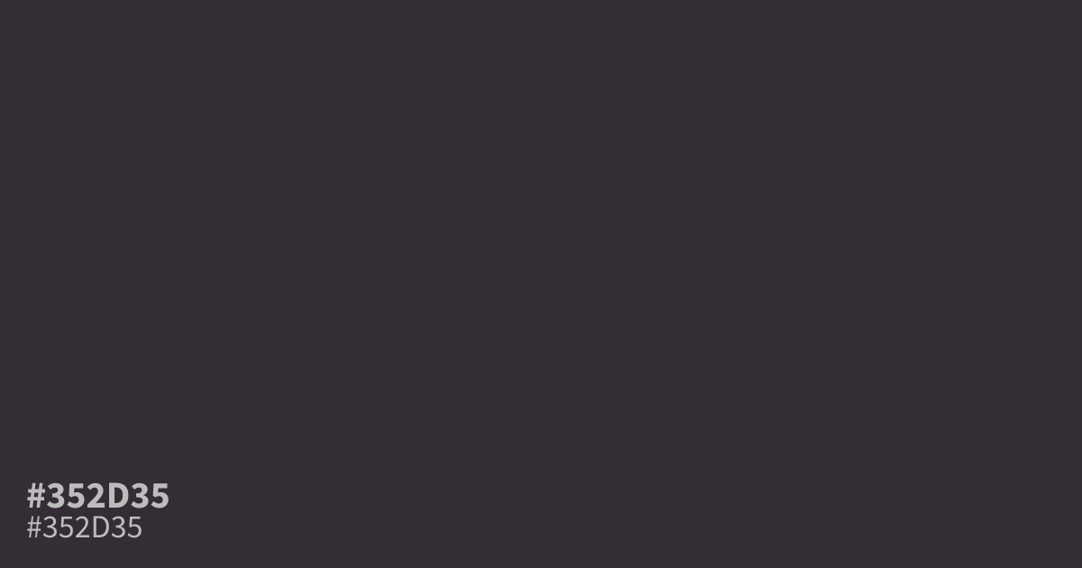
#352d35 is a dark, dusty purple that sits close to grey. Its low saturation and deep value give it a gloomy, shaded character, which suits dark mode interfaces, moody branding, and luxury packaging. White text reads clearly on top at about 13.3:1 contrast, so it passes AA for body copy. Pair it with muted plum, warm grey, or a soft gold accent to keep the palette from going flat.
Questions about #352d35
What is #352d35 in RGB, HSL and CMYK?
In RGB, #352d35 is rgb(53, 45, 53), in HSL hsl(300, 8%, 19%) and in CMYK 0%, 15%, 0%, 79%. Browse more shades of black with names and hex codes.
What colors pair well with #352d35?
Muted plum, warm grey, and soft gold accents flatter #352d35 without stealing focus. For text and UI, use plain white on top of it, since the contrast there reaches about 13.3:1 and clears WCAG AA for body copy.
Is #352d35 warm or cool?
It reads cool-leaning neutral. The purple base tips it toward the cool side, but the heavy grey saturation keeps it restrained, so it behaves more like a shaded neutral than a loud violet.
Is #352d35 readable on white or black?
#352d35 has a 13.30:1 contrast ratio on white and 1.57:1 on black. WCAG asks for 4.5:1 for body text and 3:1 for large text, so on white it works for body text and on black it is too faint for text. Try other pairs in the contrast checker.