
#352A52 Hex Color
An inky violet with dusty undertones
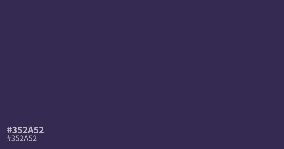
This dark, muted violet carries a dusty, inky quality that reads serious and subdued. Because it lacks saturation, #352a52 serves as an excellent, stable background for modern dark mode UI designs. Pair it with soft cream or muted gold to avoid a jarring contrast. With a high contrast ratio against white text, it maintains readability while providing a moody, structured foundation for digital layouts.
Questions about #352a52
What is #352a52 in RGB, HSL and CMYK?
In RGB, #352a52 is rgb(53, 42, 82), in HSL hsl(257, 32%, 24%) and in CMYK 35%, 49%, 0%, 68%. Browse more shades of purple with names and hex codes.
How does #352a52 perform in dark mode UI design?
The #352a52 hex color works exceptionally well as a dark mode background because it offers a muted, low-saturation violet that feels sophisticated without being harsh. Its deep tone provides an excellent contrast ratio when paired with white or soft cream text.
What color combinations work best with #352a52?
Pair #352a52 with muted golds or cream to soften its inky intensity and create a balanced, high-end aesthetic. These lighter, warmer tones prevent the dark violet from feeling too flat while maintaining the professional, structured look this shade inherently provides.
Is #352a52 readable on white or black?
#352a52 has a 13.08:1 contrast ratio on white and 1.60:1 on black. WCAG asks for 4.5:1 for body text and 3:1 for large text, so on white it works for body text and on black it is too faint for text. Try other pairs in the contrast checker.