
#351A55 Hex Color
Online color picker to view shades, tints, color codes, and complementary colors
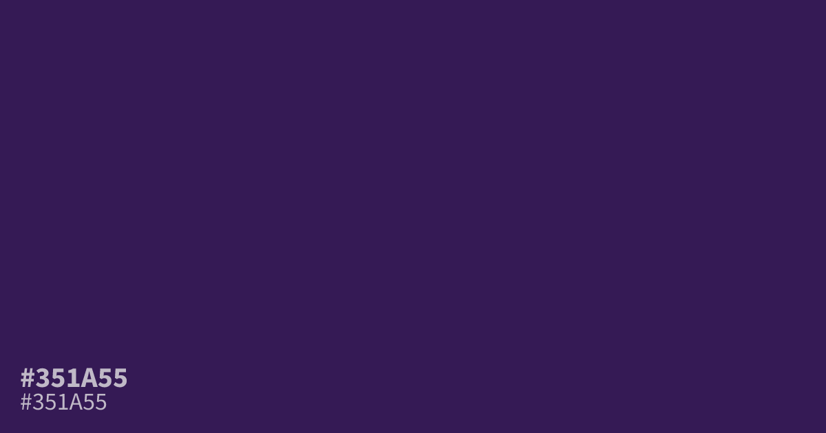
Reach for #351a55 when a design needs a deep, muted violet base for dark interfaces, gaming layouts, or moody branding. Its low saturation and blue-leaning undertone read gloomy and serious, closer to shadow than luxury. It pairs better with dusty plum or soft gold than with stark white, which looks harsh against it. The hex code #351a55 gives white text about 14.7:1 contrast, so small body copy stays readable.
Questions about #351a55
What is #351a55 in RGB, HSL and CMYK?
In RGB, #351a55 is rgb(53, 26, 85), in HSL hsl(267, 53%, 22%) and in CMYK 38%, 69%, 0%, 67%. Browse more shades of purple with names and hex codes.
What colors pair well with #351a55?
Muted gold, soft plum, and dusty rose all lift #351a55 without overwhelming it. Skip bright saturated hues next to it, since they can make it look muddy.
Is #351a55 readable on white or black?
#351a55 has a 14.68:1 contrast ratio on white and 1.43:1 on black. WCAG asks for 4.5:1 for body text and 3:1 for large text, so on white it works for body text and on black it is too faint for text. Try other pairs in the contrast checker.