
#342D64 Hex Color
Online color picker to view shades, tints, color codes, and complementary colors
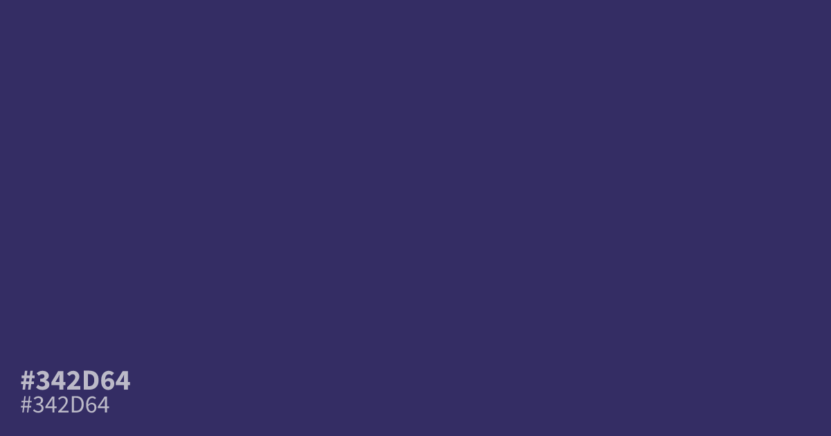
This muted, desaturated violet carries a serious and somber weight. As a dark, cool tone, #342d64 works well as a base for moody UI backgrounds or high-contrast interfaces. It pairs effectively with soft creams or pale yellows to break up its intensity. Because it offers high readability, you can use this hex code for body text without sacrificing accessibility.
Questions about #342d64
What is #342d64 in RGB, HSL and CMYK?
In RGB, #342d64 is rgb(52, 45, 100), in HSL hsl(248, 38%, 28%) and in CMYK 48%, 55%, 0%, 61%. Browse more shades of purple with names and hex codes.
What colors pair well with #342d64 for UI design?
This deep violet works best alongside high-contrast neutrals like off-white or soft creams to maintain readability. For accent colors, try pairing it with muted gold or pale yellow tones, which complement the cool, somber character of the shade.
Is #342d64 suitable for body text in web design?
Yes, #342d64 offers excellent readability when placed against lighter background colors. Its dark, desaturated composition functions as a soft alternative to pure black, providing professional, high-contrast results that meet standard web accessibility guidelines for text.
Is #342d64 readable on white or black?
#342d64 has a 12.31:1 contrast ratio on white and 1.70:1 on black. WCAG asks for 4.5:1 for body text and 3:1 for large text, so on white it works for body text and on black it is too faint for text. Try other pairs in the contrast checker.