
#342053 Hex Color
Online color picker to view shades, tints, color codes, and complementary colors
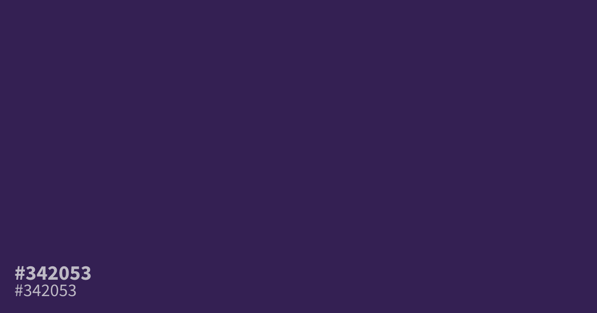
This dark, muted violet carries an undeniable sense of mystery and serious weight. Because it is so unsaturated, #342053 functions best as a sophisticated background rather than an accent. It pairs unexpectedly well with acidic chartreuse or muted peach, creating a modern contrast. White text remains perfectly legible against this deep base, making it an excellent choice for moody, high-contrast UI designs.
Questions about #342053
What is #342053 in RGB, HSL and CMYK?
In RGB, #342053 is rgb(52, 32, 83), in HSL hsl(264, 44%, 23%) and in CMYK 37%, 61%, 0%, 67%. Browse more shades of purple with names and hex codes.
What colors pair well with #342053 in a design?
Because #342053 is so dark and muted, it creates a striking, modern contrast when paired with acidic chartreuse or soft, muted peach. These lighter tones pop against the deep, serious base while maintaining visual balance and readability for UI elements.
Is #342053 a good choice for text backgrounds?
Yes, #342053 is an excellent choice for backgrounds in moody, high-contrast UI designs because white text remains perfectly legible against this dark, unsaturated base. It provides a sophisticated alternative to standard black or dark navy without sacrificing accessibility for users.
Is #342053 readable on white or black?
#342053 has a 14.21:1 contrast ratio on white and 1.47:1 on black. WCAG asks for 4.5:1 for body text and 3:1 for large text, so on white it works for body text and on black it is too faint for text. Try other pairs in the contrast checker.