
#314D60 Hex Color
Online color picker to view shades, tints, color codes, and complementary colors
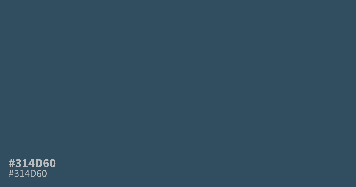
This dusty, muted blue sits on the darker side of the spectrum with significant gray undertones. Because it is low in saturation, #314d60 works well as a grounding neutral for professional brand palettes or UI backgrounds. It pairs nicely with soft creams or warm terracotta accents to cut through its gloominess. White text remains perfectly legible against this shade, offering excellent accessibility for digital interfaces.
Questions about #314d60
What is #314d60 in RGB, HSL and CMYK?
In RGB, #314d60 is rgb(49, 77, 96), in HSL hsl(204, 32%, 28%) and in CMYK 49%, 20%, 0%, 62%. Browse more shades of blue with names and hex codes.
Does #314d60 read as a warm or cool color?
#314d60 is distinctly cool, characterized by its deep blue base and heavy gray desaturation. While the blue gives it a calming, professional atmosphere, the significant gray undertones ensure it feels grounded rather than vibrant or electric, making it an excellent choice for modern, minimalist interfaces.
Which colors pair well with #314d60 for a balanced design?
You can effectively balance the coolness of #314d60 by introducing warm, high-contrast accents like soft creams or earthy terracotta. These pairings break up the gloominess of the blue while maintaining the sophisticated, muted aesthetic that defines this specific shade.
Is #314d60 readable on white or black?
#314d60 has a 8.89:1 contrast ratio on white and 2.36:1 on black. WCAG asks for 4.5:1 for body text and 3:1 for large text, so on white it works for body text and on black it is too faint for text. Try other pairs in the contrast checker.