
#2E1B5F Hex Color
Online color picker to view shades, tints, color codes, and complementary colors
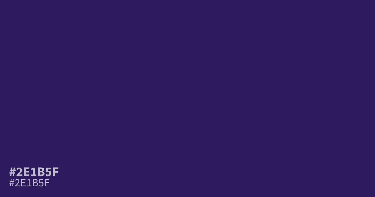
This is no bright violet. #2e1b5f is a deep, dim purple with a cool blue undertone, closer to midnight than lavender. That low lightness suits dark mode backgrounds, luxury branding, and moody gaming palettes, and white text stays readable on it at about 14.6:1 contrast. Pair it with muted gold for richness or dusty rose for softness. To build similar tones from scratch, see what colors make purple.
Questions about #2e1b5f
What is #2e1b5f in RGB, HSL and CMYK?
In RGB, #2e1b5f is rgb(46, 27, 95), in HSL hsl(257, 56%, 24%) and in CMYK 52%, 72%, 0%, 63%. Browse more shades of purple with names and hex codes.
What text color works best on #2e1b5f?
White text is the safest choice, reaching about 14.6:1 contrast, well above the WCAG AA minimum of 4.5:1. Pale tints like light lavender or warm cream also pass comfortably for body copy.
What colors pair well with #2e1b5f?
Muted gold brings out a rich, royal feel, while dusty rose softens its cold undertone. Skip bright oranges, which look harsh against a base this dark.
Is #2e1b5f readable on white or black?
#2e1b5f has a 14.60:1 contrast ratio on white and 1.43:1 on black. WCAG asks for 4.5:1 for body text and 3:1 for large text, so on white it works for body text and on black it is too faint for text. Try other pairs in the contrast checker.