
#2E1936 Hex Color
A moody, ashy purple with depth
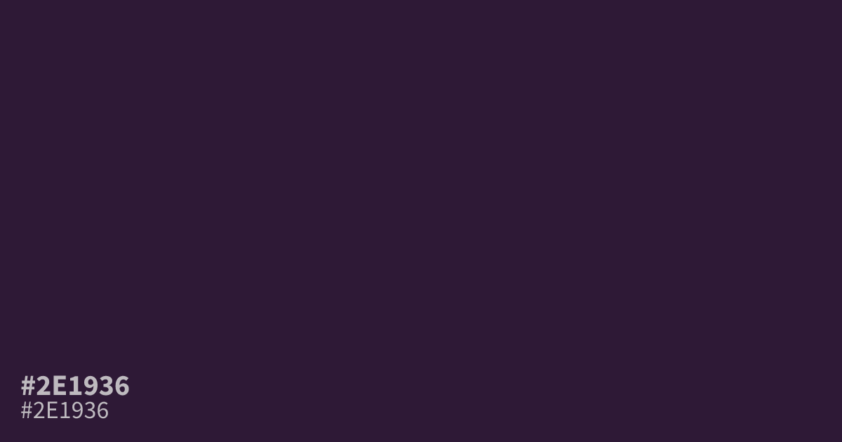
Dark and muted, #2e1936 is a cool purple with low saturation and a matte, ashy finish. Its serious, mysterious mood suits luxury branding, spiritual themes, wine labels, and moody interfaces. Use the hex code as a dominant background with white text, which reaches about 16.0:1 contrast, while brighter accents prevent the design from feeling heavy.
Questions about #2e1936
What is #2e1936 in RGB, HSL and CMYK?
In RGB, #2e1936 is rgb(46, 25, 54), in HSL hsl(283, 37%, 15%) and in CMYK 15%, 54%, 0%, 79%. Browse more shades of purple with names and hex codes.
What colors pair well with #2e1936?
Does #2e1936 read as a warm or cool color?
#2e1936 reads as a cool purple because its violet hue and low saturation lean away from red, creating a restrained, mysterious mood suited to serious, luxurious, or spiritual visual systems.
Is #2e1936 readable on white or black?
#2e1936 has a 16.04:1 contrast ratio on white and 1.30:1 on black. WCAG asks for 4.5:1 for body text and 3:1 for large text, so on white it works for body text and on black it is too faint for text. Try other pairs in the contrast checker.