
#2C1758 Hex Color
Online color picker to view shades, tints, color codes, and complementary colors
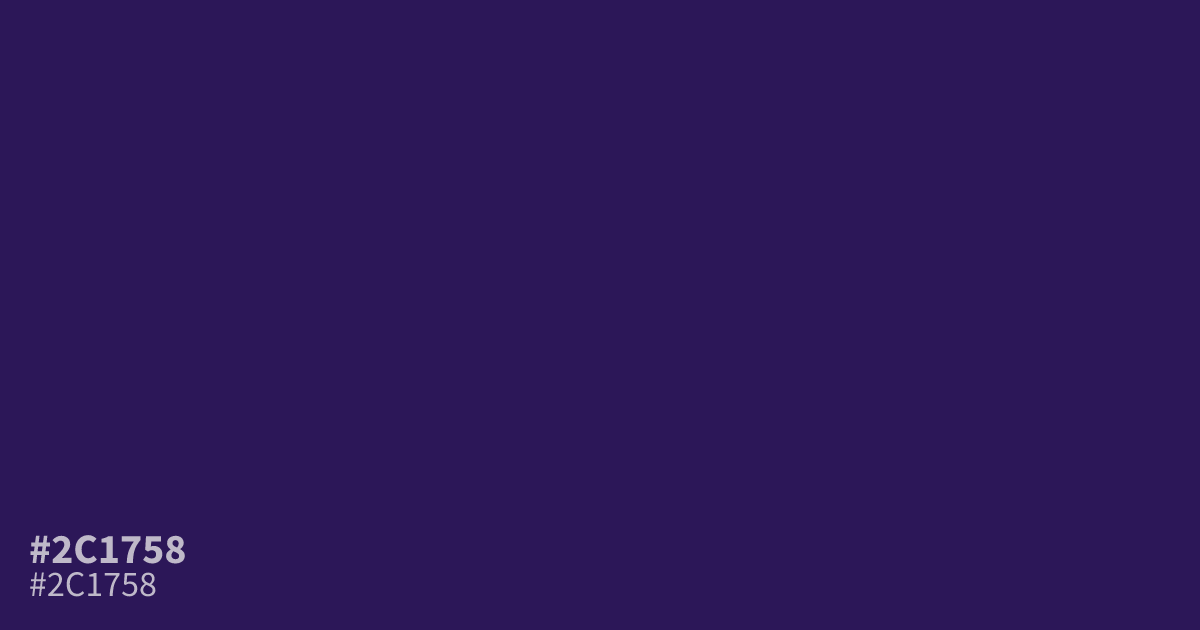
Reach for #2c1758 when a design needs a dark, moody base. This deep violet-purple is dim and cool, with a muted edge that suits dark mode UIs and luxury branding better than playful accent work. White text reads clearly on it at about 15.3:1 contrast, so small body type passes AA with room to spare. Compare it against other shades of purple to judge the depth.
Questions about #2c1758
What is #2c1758 in RGB, HSL and CMYK?
In RGB, #2c1758 is rgb(44, 23, 88), in HSL hsl(259, 59%, 22%) and in CMYK 50%, 74%, 0%, 65%. Browse more shades of purple with names and hex codes.
What colors pair well with #2c1758?
Warm golds, muted rose, and charcoal flatter #2c1758, since warm accents offset its cool cast. Keep brighter purples away from it or the scheme turns muddy.
Is #2c1758 readable on white or black?
#2c1758 has a 15.32:1 contrast ratio on white and 1.37:1 on black. WCAG asks for 4.5:1 for body text and 3:1 for large text, so on white it works for body text and on black it is too faint for text. Try other pairs in the contrast checker.