
#291A3B Hex Color
Online color picker to view shades, tints, color codes, and complementary colors
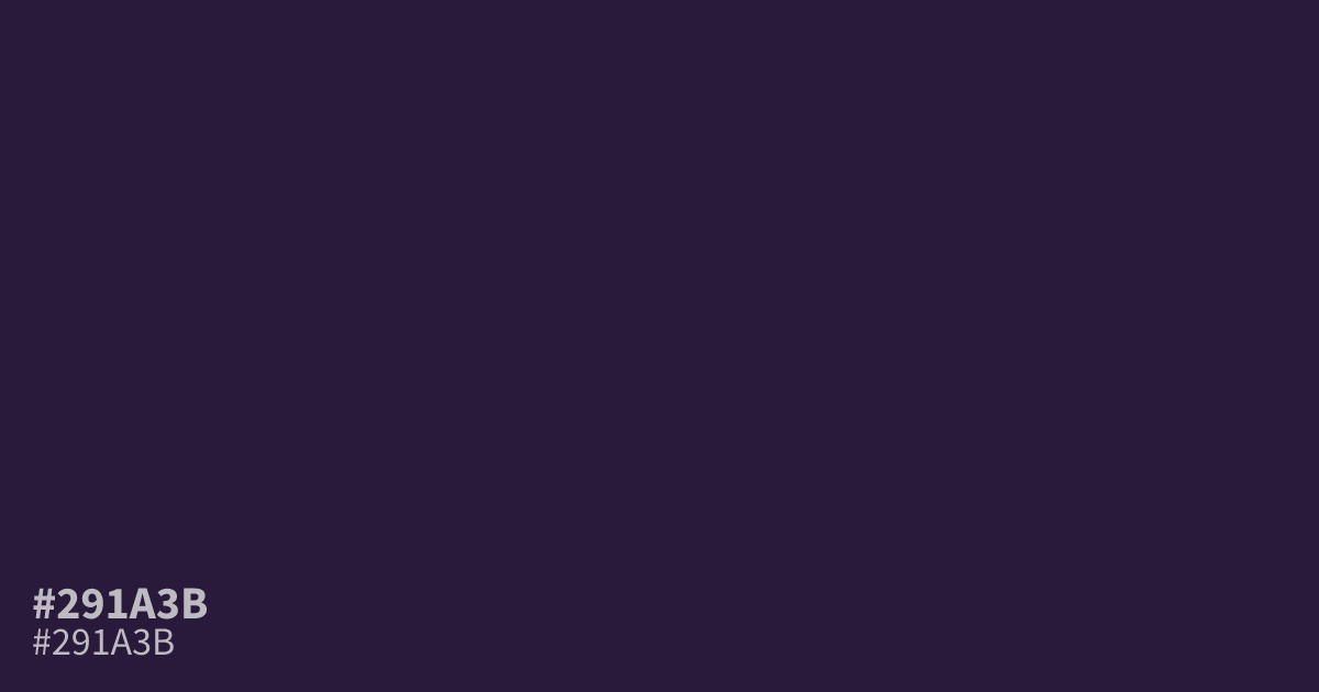
This muted, dusty violet carries a serious and somber presence. Because it sits on the cooler side of the spectrum, #291a3b works best as a moody backdrop for high-contrast UI designs. White text is exceptionally legible against this dark shade, making it a reliable choice for dark mode interfaces. Pair it with soft gold or cream accents to prevent the palette from feeling too heavy.
Questions about #291a3b
What is #291a3b in RGB, HSL and CMYK?
In RGB, #291a3b is rgb(41, 26, 59), in HSL hsl(267, 39%, 17%) and in CMYK 31%, 56%, 0%, 77%. Browse more shades of purple with names and hex codes.
What colors pair best with #291a3b for UI design?
This deep violet thrives when paired with soft, warm neutrals like cream or pale gold to balance its cool, somber intensity. Using these lighter accents prevents the interface from feeling too heavy while maintaining a professional, sophisticated aesthetic for your background.
Is #291a3b a good choice for dark mode interfaces?
Yes, this color serves as a stable base for dark mode because it offers enough saturation to avoid looking like plain black while remaining dark enough for white text to pass accessibility standards. It provides a more nuanced, premium feel than pure black backgrounds.
Is #291a3b readable on white or black?
#291a3b has a 16.08:1 contrast ratio on white and 1.30:1 on black. WCAG asks for 4.5:1 for body text and 3:1 for large text, so on white it works for body text and on black it is too faint for text. Try other pairs in the contrast checker.