
#210026 Hex Color
Online color picker to view shades, tints, color codes, and complementary colors
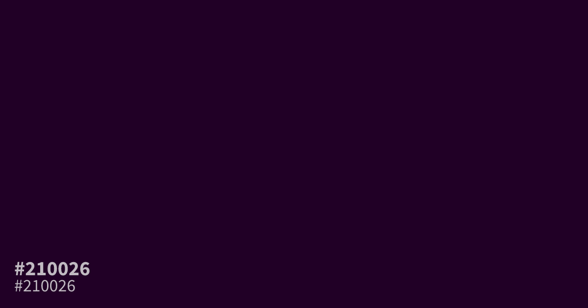
This desaturated, near-black purple reads as somber and moody. Because it offers a high 19.2:1 contrast ratio against white, designers can use this shade as a readable base for dark mode interfaces. Pair it with soft creams or metallic accents to avoid a muddy appearance. The hex code for this color is #210026.
Questions about #210026
What is #210026 in RGB, HSL and CMYK?
In RGB, #210026 is rgb(33, 0, 38), in HSL hsl(292, 100%, 7%) and in CMYK 13%, 100%, 0%, 85%. Browse more shades of black with names and hex codes.
Is #210026 a good choice for text-heavy interfaces?
Yes, #210026 offers an excellent 19.2:1 contrast ratio against white, making it a professional, high-readability alternative to standard black. It reduces eye strain in dark mode designs while maintaining a sophisticated, muted aesthetic that feels less aggressive than pure black.
Which accent colors pair well with #210026?
Soft creams and metallic golds provide a refined contrast against the darkness of #210026. Avoid high-saturation neons, as they can clash with the desaturated nature of this purple; instead, try muted terracotta or dusty rose to introduce subtle warmth.
Is #210026 readable on white or black?
#210026 has a 19.21:1 contrast ratio on white and 1.09:1 on black. WCAG asks for 4.5:1 for body text and 3:1 for large text, so on white it works for body text and on black it is too faint for text. Try other pairs in the contrast checker.