
#1E1226 Hex Color
Moody inky purple with atmospheric depth
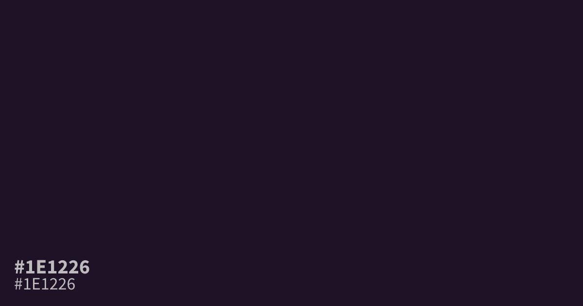
This near-black purple carries an inky, dusty character with minimal chroma. Because it is so dark, the hex code #1e1226 functions best as a moody, atmospheric background rather than fine text. It pairs beautifully with soft creams or desaturated mints for a sophisticated contrast. Since white text reads exceptionally well against this dark base, use it for bold, high-legibility interface design.
Questions about #1e1226
What is #1e1226 in RGB, HSL and CMYK?
In RGB, #1e1226 is rgb(30, 18, 38), in HSL hsl(276, 36%, 11%) and in CMYK 21%, 53%, 0%, 85%. Browse more shades of purple with names and hex codes.
How should I use #1e1226 in UI design?
#1e1226 functions best as a deep, atmospheric background that grounds a design without the harshness of pure black. Because it carries subtle purple undertones, it creates a more sophisticated, premium feel when paired with crisp white text or soft cream UI elements.
What colors pair well with #1e1226?
This dark purple pairs beautifully with desaturated mint for a modern, high-contrast aesthetic or warm cream to soften the overall mood. Avoid pairing it with other dark shades, as it lacks the luminosity to maintain readability without a clear, light-toned accent.
Is #1e1226 readable on white or black?
#1e1226 has a 17.95:1 contrast ratio on white and 1.16:1 on black. WCAG asks for 4.5:1 for body text and 3:1 for large text, so on white it works for body text and on black it is too faint for text. Try other pairs in the contrast checker.