
#1B129C Hex Color
Online color picker to view shades, tints, color codes, and complementary colors
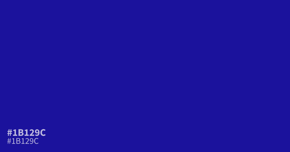
Deep, dim, and leaning purple, #1b129c sits at the heavy end of navy. Its low lightness gives it real weight, which suits dark mode backgrounds, formal branding, and large type better than fine detail. White text reads clearly on it at roughly 13.0:1 contrast. Pair it with burgundy or muted gold instead of the usual camel for a richer palette. If you want to build on it, learn what colors make blue and adjust from there.
Questions about #1b129c
What is #1b129c in RGB, HSL and CMYK?
In RGB, #1b129c is rgb(27, 18, 156), in HSL hsl(244, 79%, 34%) and in CMYK 83%, 88%, 0%, 39%. Browse more shades of blue with names and hex codes.
What colors pair well with #1b129c?
Burgundy and muted gold both flatter #1b129c better than common camel or tan choices. For text and UI, white offers about 13.0:1 contrast, which clears WCAG AA for small body text.
Is #1b129c a good choice for dark mode backgrounds?
Yes. Its very low lightness keeps screens feeling dim without slipping into black, and the slight purple undertone adds depth. Keep large areas for it and save brighter blues for accents and interactive elements.
Is #1b129c readable on white or black?
#1b129c has a 13.01:1 contrast ratio on white and 1.61:1 on black. WCAG asks for 4.5:1 for body text and 3:1 for large text, so on white it works for body text and on black it is too faint for text. Try other pairs in the contrast checker.