
#171226 Hex Color
Online color picker to view shades, tints, color codes, and complementary colors
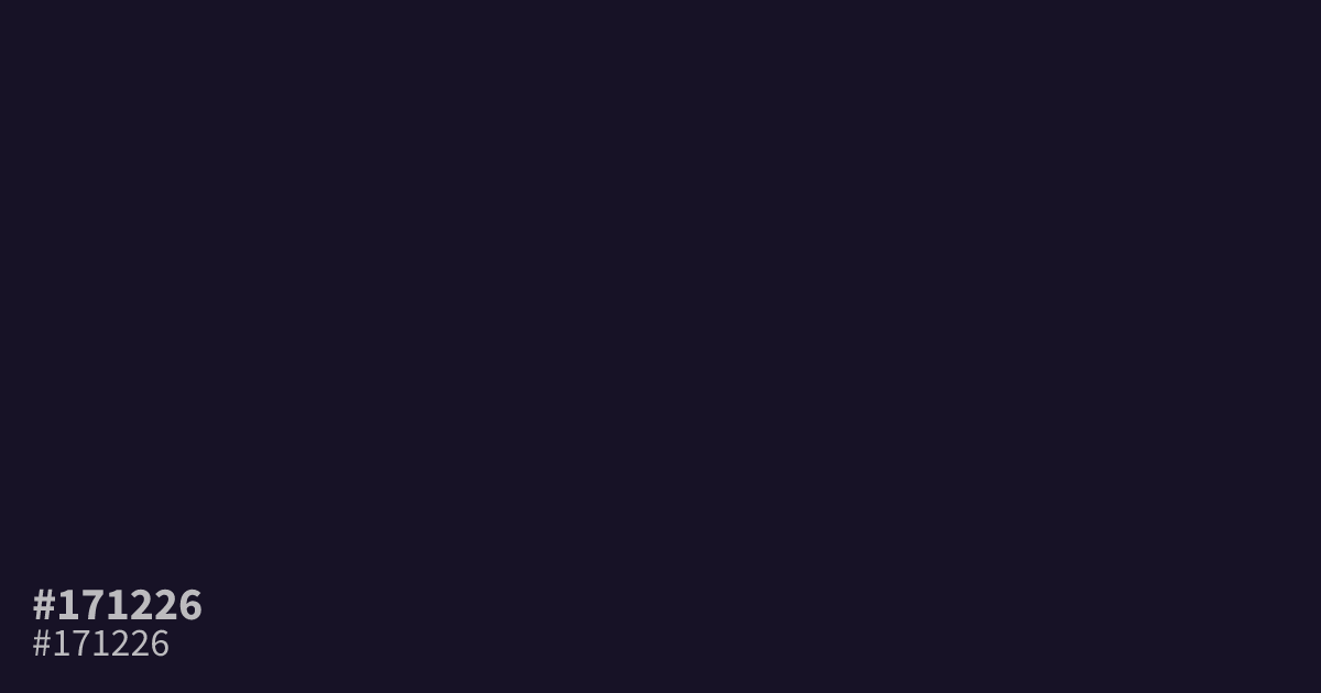
#171226 is an inky, desaturated violet that leans heavily into black. This near-midnight shade provides a grounded base for luxury or gothic design themes. Because it is so dark, use it sparingly as a dominant background to avoid muddiness. It performs best as a dramatic frame for white text, offering high legibility with a contrast ratio of 18.2:1. The hex code for this moody purple is #171226.
Questions about #171226
What is #171226 in RGB, HSL and CMYK?
In RGB, #171226 is rgb(23, 18, 38), in HSL hsl(255, 36%, 11%) and in CMYK 39%, 53%, 0%, 85%. Browse more shades of black with names and hex codes.
How should #171226 be used in layout design?
Because #171226 is extremely dark, reserve it for accents or as a dramatic, sophisticated background rather than filling large spaces that could muddy your layout. It works exceptionally well when paired with crisp white text to ensure maximum readability and visual impact.
Which colors create a balanced palette with #171226?
Use high-value neutrals like cool gray or soft creams to keep the look clean, or introduce metallic accents like gold to lean into luxury themes. Avoiding overly vibrant hues prevents the deep violet from looking unintentionally muddy or flat.
Is #171226 readable on white or black?
#171226 has a 18.24:1 contrast ratio on white and 1.15:1 on black. WCAG asks for 4.5:1 for body text and 3:1 for large text, so on white it works for body text and on black it is too faint for text. Try other pairs in the contrast checker.