
#135AA5 Hex Color
Online color picker to view shades, tints, color codes, and complementary colors
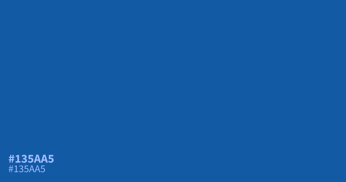
This cool, muted blue leans into serious and professional applications. Because it is darker and unsaturated, #135aa5 acts as a reliable base for UI layouts and corporate branding. It maintains strong legibility against white text, offering a solid 6.9:1 contrast ratio. Designers should use this shade in large blocks rather than fine detail, as it pairs effectively with soft, warm grays to balance its rigid character.
Questions about #135aa5
What is #135aa5 in RGB, HSL and CMYK?
In RGB, #135aa5 is rgb(19, 90, 165), in HSL hsl(211, 79%, 36%) and in CMYK 88%, 45%, 0%, 35%. Browse more shades of blue with names and hex codes.
What colors pair best with #135aa5 in a UI design?
Use soft, warm grays or off-white tones to balance the rigid, cool nature of #135aa5 without overwhelming the interface. Incorporating a muted terracotta as an accent can provide a subtle, sophisticated warmth that prevents the design from feeling too sterile.
Is #135aa5 a good choice for text-heavy corporate branding?
This shade is an excellent choice for headers and UI elements because it maintains strong legibility against white backgrounds with a solid 6.9:1 contrast ratio. However, avoid using it for small body text where high-contrast black or dark charcoal is generally preferred.
Is #135aa5 readable on white or black?
#135aa5 has a 6.92:1 contrast ratio on white and 3.03:1 on black. WCAG asks for 4.5:1 for body text and 3:1 for large text, so on white it works for body text and on black it works only for large text (24px, or 18.5px bold). Try other pairs in the contrast checker.