Plain and clean, the color white makes a bold statement.
When every wavelength is reflected from a surface, our eyes see the color white. On the other hand, we perceive the color black when a negligible amount of light is reflected.
White conjures images of purity, orderliness, and innocence, and it might make a room seem more spacious. But white spaces can also seem stark, sterile, bland, and empty. White may seem icy and cold as well.
We may associate white with ‘clean slates’, which is why the color is also often linked to ‘new beginnings’ or ‘fresh starts’.
Since it has no hue, and some people don’t even consider it a color, you might wonder how white is created. What colors make white?
The Quick Version
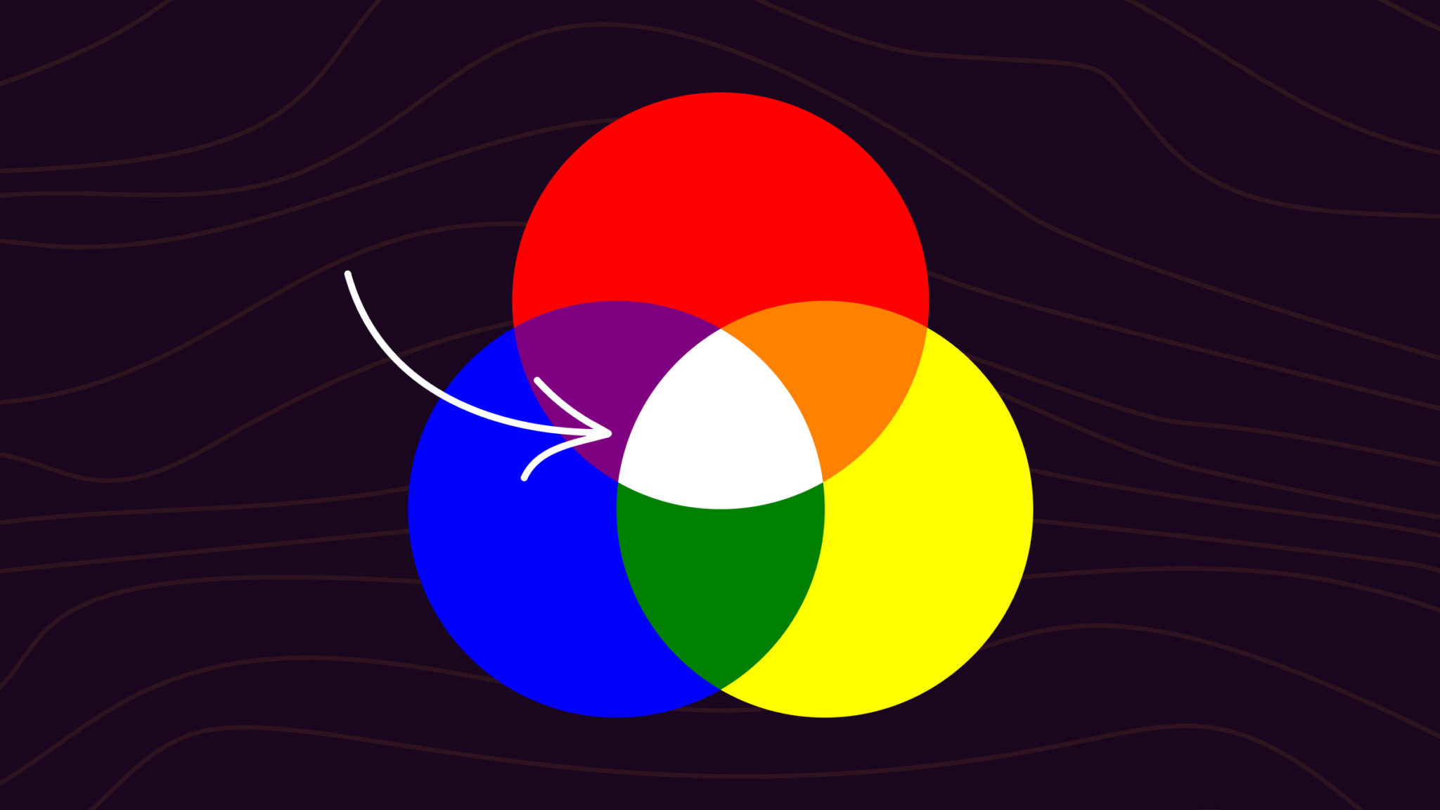
White occurs when all light wavelengths reflect. In additive color, red, green, and blue light combine to make white. Subtractive mixing with paints, whether under an RGB or CMY model, cannot create white. White is achromatic, which means without color.
To make white paint, use white pigments (such as calcium carbonate, zinc oxide, lead carbonate, calcium hydroxide). Tint white to get off-white shades.
Understanding Mixing Colors
There are two ways you can mix colors.
The first is additive mixing, which is the process of combining two or more different hues of light. This is most commonly used for digital displays: computer screens, TVs, mobile devices, and so on.
Since every color of light adds to the previous ones, the resulting color can be brighter. Adding all the primary colors of light (red, green, and blue) together creates white.
Then, there is subtractive mixing, which is the type that most people are familiar with. This technique involves blending colored substances like paints or inks to produce a different hue. This method can’t create white.
Achromatic Colors
Sometimes, people think of black and white as being outside the spectrum of colors. These colors do not exist the same way as others do since they are often a type of shading that changes the brightness or darkness of another color.
For this reason, black and white are known as achromatic colors. They are only a shade; they do not possess any hue or saturation.
Gray is another achromatic color, in between black and white.
Overall, while creating white, it is important to recognize that it has a few inherent limitations that make it hard for artists to produce the color from scratch.
What Colors Make White?
When blue, green, and red light are added together, the result is white light. But no mix of other hues will result in white paint. Instead, mixing all the primary colors – whether under the RYB model (red, yellow, and blue) or the CMY model (cyan, magenta, and yellow) – will create a muddy brown or black. This means that for white paint or ink, you need a white pigment in the first place.

Since white denotes the lack of color, the more colors you mix in, the farther you are from obtaining white.
Instead, you’ll begin producing deeper tones until you end up with the color black.
Unfortunately, there is no method to combine two colors to get white, regardless of what you do. You would need to remove the entire saturation of the hue. It’s best to use pre-created white substances (paints, for example).
One fun way to create an illusion of white from colored paint is to make a simple rainbow disc spinner, where the colors combine to make white. This is because the eye is perceiving all the colors as light simultaneously.
How Do You Make White Paint?
You might be wondering how white paint is made in the first place! The answer lies in the use of white pigment. A white pigment is combined with a medium, such as alkyd resin or acrylic, to make white paint. Typically, calcium hydroxide, mineral powders, zinc oxide, lead carbonate, and calcium carbonate are used as pigments by paint makers.
The process of producing white paint demands precise chemistry, so this probably isn’t one to try at home. Some substances used to create white pigments can be harmful.
Mixing Various Off-White Colors
Although making white paint may not be an option, many artists will produce various off-white options using different colors. This is because any kind of white paint can have various accents and hints added to it.
Here is how you can create the most popular ‘almost white’ hues:
Common Off-White Hex Colors
| Name | Hex Code | RGB Value |
|---|---|---|
| Light Honey | #ECE3CF | rgb(236, 227, 207) |
| Eggshell | #F0EAD6 | rgb(240, 234, 214) |
| Ivory | #FFFFF0 | rgb(255, 255, 240) |
| Beige | #F5F5DC | rgb(245, 245, 220) |
| Off White | #FAF9F6 | rgb(250, 249, 246) |
| Pale Almond | #E8D8C1 | rgb(232, 216, 193) |
To keep the colors you are using from making your white too saturated, there are a few best practices you can stick to. First off, rather than add white to the other colors, add those colors to the white.
Secondly, always begin by dabbing a small amount … probably less than what you feel you need for your desired shade. Pure white will quickly change in the presence of dominant hues like black and brown.
The nice thing about using white is that it is very forgiving – if you go too far with the color you’re adding, simply put more white into the mix.
White in Design
The color white is often used as a negative space, for a plain wall, blank sheet of paper, or white space around text.
White is typically seen as being clean and pure. As a canvas, white is seen as unblemished, calming, and welcoming. You can use white much more skillfully in your designs if you know how it impacts our perceptions and our senses.
Additionally, white is far more brilliant than other hues. It can come across as a brilliant light in a design since even colors like yellow or brilliant green look dull when compared to pure white.
Be cautious, though: if a region of your work is entirely white, people might assume that the design is missing something or that that particular area is blank.
For this reason, it is essential that you design it in a way that makes it obvious that it belongs there.
Overall, if you know how to use it properly, white is a great method to add shine and luster to a project.
Using White in Interior Design
In interior design, white not only serves as a great foundation for distinctive elements, but it also suggests openness and calm.
As mentioned, there are numerous shades of off-white, which is why the color is far from a boring choice. White is often associated with minimalism, but you don’t have to be a minimalist to appreciate its style. Here is how you can use this timeless achromatic color when designing or renovating your home:
Creating an Illusion of Space
The properties of white allow it to reflect all wavelengths of visible light. This helps make spaces bigger and more open. White is often used as a neutral wall color, and when used on floors and furniture, it can make a room look bigger. Also, white can open up small spaces like hallways and nooks, as well as spaces above windows and door frames, by reflecting more natural light.
Making a Chic Appearance
A second benefit of white is that it can be used as a base for flexibility. Because it is neutral, it doesn’t clash with things like hidden storage spaces, extendable lamps, and foldaway desks. Instead, white gives any room a stylish look, no matter how big or small it is. When you combine warm white shades with soft lighting, the result is a welcoming, roomy ambience.
You can also use LED lighting to make the white color stand out in your interior. Try putting the lights under your stairs to create a kind of glowing appearance.
Establishing a Purpose
White can emphasize the meaning or purpose of a room. For example, since white represents purity and cleanliness, it often makes sense for bathrooms. On a practical level, white bathroom fixtures can be bleached clean, whereas colored fixtures might be discolored by bleach.
In other rooms, like the living room or kitchen, white elements can make a space look more modern. Mix white with other netural tones like a black TV mounted on the wall and silver lamps for a sleeker appearance. Hanging prints and photos in white frames on the wall is also trendy right now.
White with pastel colors is a fun way to liven up a child’s room or a creative space like an office. You can also go for a white wall with accent colors to create a striking look.
Experimenting
When designing with white, texture is essential. Mixing different shapes, like oval tables with cube shelves and straight furniture, is a simple way to add layers. A large white lampshade is another great finishing touch because it creates depth and establishes a central point of interest.
If you’re worried about having too much white in your home, go for wooden floors. Wood’s earthy tones go well with white and make things feel more natural. Marble is also a good match because it is slightly white and goes well with a white color scheme. Marble is great for kitchen countertops or you could even try a wall with a marble pattern.
If your home is mostly white, you might want to experiment with splashes of colors. The white background will help to accentuate those colors further. Try out bold, block colors on plant pots, grocery bags, and rugs, which will give a room more personality. A single brick or concrete wall can add even more industrial style to a space that is mostly white.
Note that white can often appear as blue or orange due to different light sources in the real world. For example, you may have slightly blue light coming from a light bulb, making a white shade appear blue. The same goes for a white piece of paper on a sunny day. The colors of light can affect how white is perceived.
Home Gallery
There’s a reason why most walls in art galleries are white: it keeps the attention on the art.
You can also do this if you want one piece or a group of pieces to take over a room. Add splashes of color that aren’t as eye-catching to make the room feel cosy enough for everyday life.
FAQs
What colors of light make white?
Red, green, and blue light mixed at equal, bright levels create white. This is called additive mixing.
Why do phone and TV screens use RGB for white?
Screens emit light. They blend red, green, and blue pixels at full power to make white, often shown as RGB 255, 255, 255 or hex #FFFFFF.
Can I mix paints to make white?
No. Paints work by subtractive mixing. Mixing colors absorbs more light, so you get grays or browns, not white. White paint is a pigment, usually titanium dioxide.
What about printing, do CMY inks make white?
No. Printers make white by leaving paper unprinted. Combining cyan, magenta, and yellow absorbs most light, which creates a dark brown, dark gray, or black, not white.
Can spinning a color wheel make white?
Yes. Fast spinning blends colors in your vision. This is additive in effect, so balanced segments can appear nearly white under strong light.
Why does white look different under different bulbs?
Color temperature and spectrum vary. Warm bulbs shift white toward yellow or red, cool bulbs shift it toward blue. CRI also affects how neutral white appears.
Wrapping Up
Subtractive mixing can be used to create any color on the spectrum … but that doesn’t include white. White is not the presence but the absence of color.
That said, there is no doubt that white has a dramatic subtlety to it – something that makes it an immensely fun color to play around with. Once you know how to mix white with other colors to make different off-whites, you can make more realistic depth, texture, and shadows.
To learn more about mixing and creating new colors, take a look at our articles on making red, yellow, and blue. You might also want to read up on the color wheel to get the most out of color theory.
I appreciate the explanations given for color white. I had confusion that white could be derived from mixing basic colors in different shades.
Thanks for clarifying my query
thanks so much for the explanation of the colour white.
appreciate it and like to learn more about colors.👍🙏