Blue is a primary color in paint (RYB) and in digital light (RGB), so you cannot mix a pure blue from other paints or from other wavelengths of light. In CMYK printing, though, cyan and magenta combine to produce blue. If you already have blue and want a specific shade, you can shift it: add white to lighten, black to darken, green to cool, or purple or red to warm it.
Below, we walk through all three color models (RGB light, CMY printing, RYB paint), show nine classic blue shades with mixing notes, list 13 hex codes, and link to ready-made palettes you can copy into any design tool. Whether you spell it “colors” or “colours”, the answer is the same.
The Short Answer
In paint (RYB) and in light (RGB), blue is a primary color. You cannot mix other colors to make it. In CMYK printing, cyan and magenta combine to produce blue. To shift an existing blue, adjust it with white, black, green, purple, or gray to get shades like navy, royal, teal, turquoise, and powder blue.
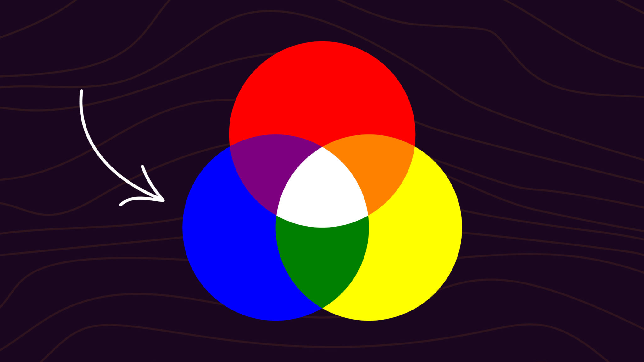
Blue is one of the three primary colors of the RYB (Red, Yellow, Blue) color wheel.

What Colors Make Blue?
The answer depends on which color system you are working in.
In paint (RYB): blue is a primary color alongside red and yellow. You cannot mix a pure blue from other paints. You can, however, produce close approximations by mixing cyan-leaning pigments with a hint of magenta or purple.
In light (RGB): blue is a primary color alongside red and green. Digital screens display blue directly from a blue LED or sub-pixel. You cannot combine other colors of light to produce pure blue.
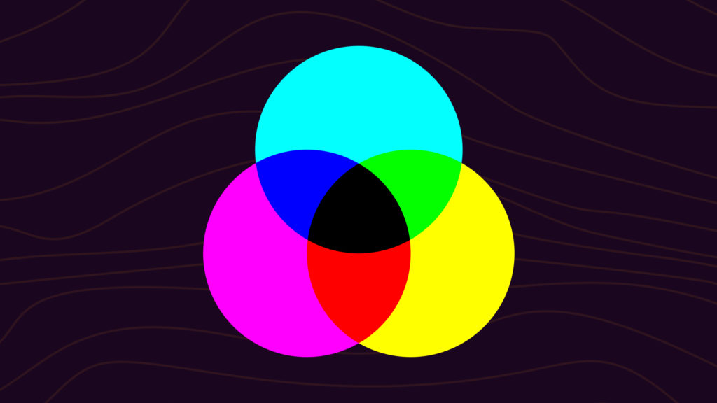
In print (CMYK): blue is a secondary color, formed by combining cyan and magenta inks. Cyan is a greenish-blue. Magenta is a purplish-red. Together they absorb enough red and green light to leave blue visible.
Once you have a blue to work with, you can build an entire family of blue-inspired colors: different shades of blue like dark blue, navy blue, sky blue, and light blue.
How to Make Blue (Step-by-Step)
If you’re working with paint, you can’t make blue from scratch. You need a blue pigment to start. The good news is that almost any blue, from a tube of student-grade acrylic to a budget watercolor pan, will get you to a working blue with a few small adjustments. The process most painters and designers follow:
- Start with the right base blue. Pick a tube of ultramarine for a warm, slightly violet-leaning blue, or cobalt blue for a cooler, more neutral starting point. Phthalo blue works if you want maximum saturation, but it stains heavily and is hard to control.
- Decide which direction you want to shift. Lighter or darker (lightness), brighter or duller (saturation), warmer or cooler (temperature). Knowing the direction up front saves you from over-mixing.
- Lighten with white, in small amounts. A little white moves the color a long way. Start with a fingertip-sized dab and build up.
- Darken with black or with a complementary orange. Black darkens cleanly. Burnt umber or a touch of cadmium orange darkens with more depth and warmth, but pushes the blue toward gray if you go too far.
- Cool the blue with green. A small amount of phthalo green or veronese green pulls the blue toward teal and turquoise. Useful for ocean and sky tones.
- Warm the blue with red or magenta. Alizarin crimson or quinacridone magenta nudges the blue toward violet and indigo. Useful for shadows and twilight tones.
- Test on a swatch before committing. Mix a small amount, paint it next to your target color, and let it dry. Wet paint reads brighter than dry paint, especially in oils and acrylics.
If you’re working in CMYK or RGB, the process is different. In CMYK, blue comes from combining cyan and magenta in roughly equal amounts (more cyan for teal, more magenta for violet). In RGB, blue is already a primary on screen, so you don’t mix it. You just set the blue channel to the value you want and adjust red and green to shift the hue.
Mixing Different Shades of Blue
Starting from a basic blue, you can reach nearly every blue-adjacent hue by adding white (to tint), black (to shade), or a neighboring color from the color wheel to shift its temperature and character. Each shade below has a recipe you can mix on a palette today, plus the closest hex code if you need to match it digitally.
How to Make Navy Blue
Navy blue is a deep, dark blue with almost no warmth. Mix navy by combining ultramarine or cobalt blue with a small amount of black, in a roughly 8:1 ratio. Avoid using too much black, which will gray the color out. For a richer navy, use burnt umber instead of black. The closest hex code is #000080.

How to Make Royal Blue
Royal blue is brighter and slightly more violet than navy. Mix royal blue by combining ultramarine blue with a small amount of magenta or red-violet, in roughly a 5:1 ratio. Stay away from black, which will dull it. The closest hex code is #4169E1.

How to Make Cornflower Blue
Cornflower blue is a softer, slightly muted mid-blue. Mix cornflower by adding a small amount of gray to ultramarine or cobalt blue. You can make the gray from black plus white, or use a touch of complementary orange to dull the blue without darkening it. The closest hex code is #6495ED.

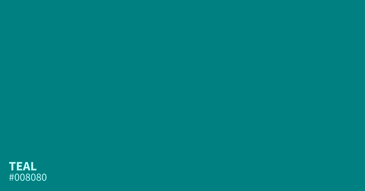
How to Make Teal
Teal is a blue-green that sits roughly halfway between blue and green on the color wheel. Mix teal by combining ultramarine or cobalt blue with phthalo or veronese green in a 1:1 ratio. Adjust toward more blue or more green to taste. The closest hex code is #008080.
How to Make Turquoise
Turquoise is a brighter, lighter cousin of teal with more green and a hint of warmth. Mix turquoise by combining cadmium green with cobalt blue, then adding a small amount of white to brighten. For a more saturated turquoise, use veronese green. The closest hex code is #40E0D0.

How to Make Cobalt Blue
Cobalt blue is a clean, slightly warm mid-blue with high saturation. If you don’t have cobalt pigment, the closest mix is turquoise plus ultramarine in roughly a 1:3 ratio. You can also approximate cobalt by adding a tiny amount of phthalo green to ultramarine. The closest hex code is #0047AB.

How to Make Cerulean Blue
Cerulean is a sky-leaning blue, lighter and slightly greener than cobalt. Mix cerulean by combining cobalt blue with a small amount of white. For a more accurate cerulean, add a tiny amount of phthalo green to push it slightly toward teal. The closest hex code is #007BA7.

How to Make Indigo
Indigo is a dark blue-violet, deeper than navy and warmer than royal. Mix indigo by combining ultramarine blue with a small amount of red or alizarin crimson, in roughly a 4:1 ratio. Avoid black, which will mute the violet. The closest hex code is #4B0082.

How to Make Powder Blue
Powder blue is a soft, light, slightly muted blue. Mix powder blue by adding a generous amount of white to royal blue or cobalt, then a tiny amount of gray to take the saturation down. For a cooler powder blue, lean toward cobalt. For a warmer one, lean toward royal blue. The closest hex code is #B0E0E6.

How to Make Light Blue
Light blue is the simplest variation: any base blue plus white. Start with cobalt or cerulean blue and add white in small increments until you reach the lightness you want. For a softer light blue, mute the result with a tiny dab of complementary orange. The closest hex code is #ADD8E6.

How to Make Dark Blue
Dark blue covers a range of deep blues from midnight to navy. Mix dark blue by adding a small amount of black to ultramarine or cobalt. For a cleaner dark blue, use burnt umber instead of black to avoid graying out the color. The closest hex code is #00008B.

Quick Reference: Blue Mixing Cheat Sheet
Every blue shade above in one extractable table. Save it, copy it, paste it into a doc.
| Shade | Hex | Mixing Recipe |
|---|---|---|
| Navy Blue | #000080 | Ultramarine + Black (8:1) |
| Royal Blue | #4169E1 | Ultramarine + Magenta (5:1) |
| Cornflower | #6495ED | Ultramarine + Gray (small) |
| Teal | #008080 | Cobalt Blue + Phthalo Green (1:1) |
| Turquoise | #40E0D0 | Cobalt + Cadmium Green + White |
| Cobalt | #0047AB | Turquoise + Ultramarine (1:3) |
| Cerulean | #007BA7 | Cobalt + White + tiny Phthalo Green |
| Indigo | #4B0082 | Ultramarine + Alizarin Crimson (4:1) |
| Powder Blue | #B0E0E6 | Royal Blue + lots of White + Gray |
| Light Blue | #ADD8E6 | Cobalt or Cerulean + White |
| Dark Blue | #00008B | Ultramarine + Black or Burnt Umber |
| Sky Blue | #87CEFA | Cerulean + White (lots) |
| Electric Blue | #0000FF | Pure Ultramarine or Phthalo Blue |
Common Blue Hex Codes
Here are 13 blue shades with hex codes and RGB values, ready to paste into Figma, CSS, or any design tool. Each hex code links to its ColorKit page with palettes, variations, and CSS snippets.
| Name | Hex Code | RGB Value |
|---|---|---|
| Navy Blue | #000080 | rgb(0, 0, 128) |
| Royal Blue | #4169E1 | rgb(65, 105, 225) |
| Cornflower | #6495ED | rgb(100, 149, 237) |
| Teal | #008080 | rgb(0, 128, 128) |
| Turquoise | #40E0D0 | rgb(64, 224, 208) |
| Cobalt | #0047AB | rgb(0, 71, 171) |
| Cerulean | #007BA7 | rgb(0, 123, 167) |
| Indigo | #4B0082 | rgb(75, 0, 130) |
| Powder Blue | #B0E0E6 | rgb(176, 224, 230) |
| Sky Blue | #87CEFA | rgb(135, 206, 250) |
| Light Blue | #ADD8E6 | rgb(173, 216, 230) |
| Dark Blue | #00008B | rgb(0, 0, 139) |
| Electric Blue | #0000FF | rgb(0, 0, 255) |
A few of the most-viewed blues on ColorKit, up close:

To build a ramp of tints and shades from any of these blues, drop the hex into the shade generator. If you want a full palette built around one of these colors, start with the color picker.
Ready-made Blue Palettes
If you want blue already paired with complementary colors, these palette collections give you ready-to-copy hex sets. Open any of them in ColorKit to tweak, save, or export as CSS.
- Blue palettes: Hand-picked blue-first palettes across the site, from pale sky blues to deep navy combos.
- Ocean palettes: Teal, navy, and aqua combinations that evoke sea, shore, and sky.
- Pastel blue palettes: Soft pastel blue combos that pair well with blush, cream, and mint.
- Navy palettes: Deep navy as an anchor, balanced with neutrals, gold, or accent brights.
To generate your own palette, use the palette generator, or pull one directly from a photo using the palette from image tool.
Creating Muted Shades of Blue
Muted blues are low-saturation variants, and they come from mixing blue with its complementary color, orange. On the color wheel, blue and orange sit directly opposite each other. Mixed together, they neutralize each other.
Ultramarine blue plus a small amount of cadmium orange produces a deep, slightly dulled blue. Keep the orange light: too much and the mixture shifts toward brown or green.

For a browner muted blue, combine burnt umber with ultramarine or cobalt blue. This is useful for shadows, worn denim tones, or earthy design palettes.
Creating Warmer Shades of Blue
Blue is a cool color by default, but you can warm it by adding a small amount of red, magenta, or cadmium green. Ultramarine is already a relatively warm blue, so it is the easiest starting point.
Ultramarine plus alizarin crimson produces a softer, warmer blue leaning toward violet. Cobalt blue plus cadmium green produces a warm-but-cool blend, closer to an inky teal. Cobalt blue starts cooler than ultramarine, so the result reads less warm overall.
Creating Turquoise Blue Colors
Turquoise lives on the edge of blue and green, often with a hint of yellow warmth. The simplest way to reach it from a base blue is to add green, then brighten with white.
Cadmium green plus ultramarine or cobalt blue gives a saturated turquoise. Adding white produces a lighter, pool-water turquoise.
For a rich, high-chroma turquoise, combine veronese green (a vivid cool green) with cobalt or ultramarine blue. The resulting blue keeps most of its brilliance, and a hint of white pushes it toward a luminous aqua without going gray.
Why Your Blue Mix Goes Wrong
Even with the right pigments, blue is one of the easier colors to muddy or shift unintentionally. The four most common problems and how to fix them:
- Your blue looks purple. There’s red somewhere in the mix. Either your base blue leans warm (ultramarine has a touch of red), your white has a slight pink tint, or you’ve added too much complementary orange. Switch to cobalt or phthalo blue for a cleaner cool base, or use a cooler white.
- Your blue looks gray or muddy. You’ve added too much black or too much complementary orange (which shifts blue toward brown). Pull back, scrape it off if you can, and add a small amount of pure base blue back into the mix to recover saturation. Glaze with a transparent blue to restore depth without re-mixing from scratch.
- Your blue looks washed out. Too much white, or your base blue was already low-saturation. Restart with a higher-chroma blue (phthalo blue, cerulean) and add white in smaller amounts.
- Your blue won’t mix evenly. Phthalo blue is famously hard to control because it’s so concentrated. Use a tiny amount and increase slowly. If you’re working in oils, make sure your medium ratio is consistent across the mixing area.
In digital design, the equivalent issues are easier to fix because nothing is permanent. If a blue looks wrong on screen, switch to HSL mode and check the hue, saturation, and lightness values. A blue with hue close to 240° and high saturation will read as a true blue. Drift toward 220° pulls toward cyan, drift toward 260° pulls toward violet.
FAQs
What two colors make blue in paint?
You cannot make blue from other paints. Blue is a primary color in the RYB paint model, so it has to come from a blue pigment. What you can do is shift an existing blue warmer, cooler, lighter, or darker by mixing in small amounts of other colors.
What two colors make blue in CMYK?
Cyan plus magenta makes blue in CMYK. Adjust the ratio to shift the hue: more cyan pushes toward teal, more magenta toward violet.
Can you make blue with RGB light?
No. Blue is one of the three primary colors in RGB (red, green, blue). Digital screens display blue directly from a blue sub-pixel. You cannot combine red and green light to produce blue.
Why does my blue look purple when I mix it?
There is red in the mixture. Your yellow or green pigment may lean warm and carry red, or the blue you started with has magenta in it. Switch to a cooler base (ultramarine instead of cobalt, or a greener yellow) or reduce the red/magenta.
How can I keep blues bright in a painting?
Start with a clean, high-chroma blue like ultramarine or cobalt. Avoid overmixing. Use complementary orange sparingly when muting. Glaze with transparent blues to add depth without muddying, and keep your whites clean.
What colors make navy blue?
Navy blue is made by adding a small amount of black or burnt umber to ultramarine or cobalt blue, in roughly an 8:1 ratio. Too much black grays out the color, so add slowly.
How do I make royal blue?
Royal blue is made by adding a small amount of magenta or red-violet to ultramarine blue. Aim for roughly a 5:1 ratio of blue to magenta. Avoid black, which dulls the brightness royal blue depends on.
How do I lighten my blue without washing it out?
Add white in very small amounts and use a higher-chroma starting blue like phthalo or cerulean. Phthalo blue holds its saturation when lightened in a way that ultramarine doesn’t. If you’ve already gone too pale, add a small amount of pure base blue back in to recover the color.
Can I make blue with food coloring?
Yes. Most food coloring sets include a pure blue (typically Brilliant Blue FCF, or Blue 1). To shift it: add a tiny amount of red food coloring for purple-leaning blue, or a tiny amount of yellow for green-leaning blue. You can’t make blue from other food colors though, the same as with paint, since blue is one of the primary food coloring hues.
What colours make blue? (UK spelling)
Same answer, different spelling. In paint and in light, blue is a primary colour and cannot be mixed from other sources. In CMYK printing, cyan and magenta combine to produce blue.
Putting It Into Practice
Blue sits in a useful spot in color theory: it is primary in paint and in light, but secondary in printing. Once you know which system you are working in, the answer is clear. On a canvas, start with a blue pigment and shift it. In CMYK, combine cyan and magenta. On a screen, you are not mixing anything: the blue sub-pixel does the work.
When you adjust blue, go slowly. A little complementary orange shifts it a lot. To explore hex-level variations without guessing, drop any blue hex into the shade generator for an instant ramp of tints and shades. Or try blue plus white in the color mixer to preview a tint live.
cyan is blue in color so how do you make that color blue. you didn’t explain nothing all you did was use the blue that was there.
I agree, I’m still in the dark how to get my blue color by mixing 2 colors.
Very bad article!!