
#FAF2E9 Hex Color
Online color picker to view shades, tints, color codes, and complementary colors
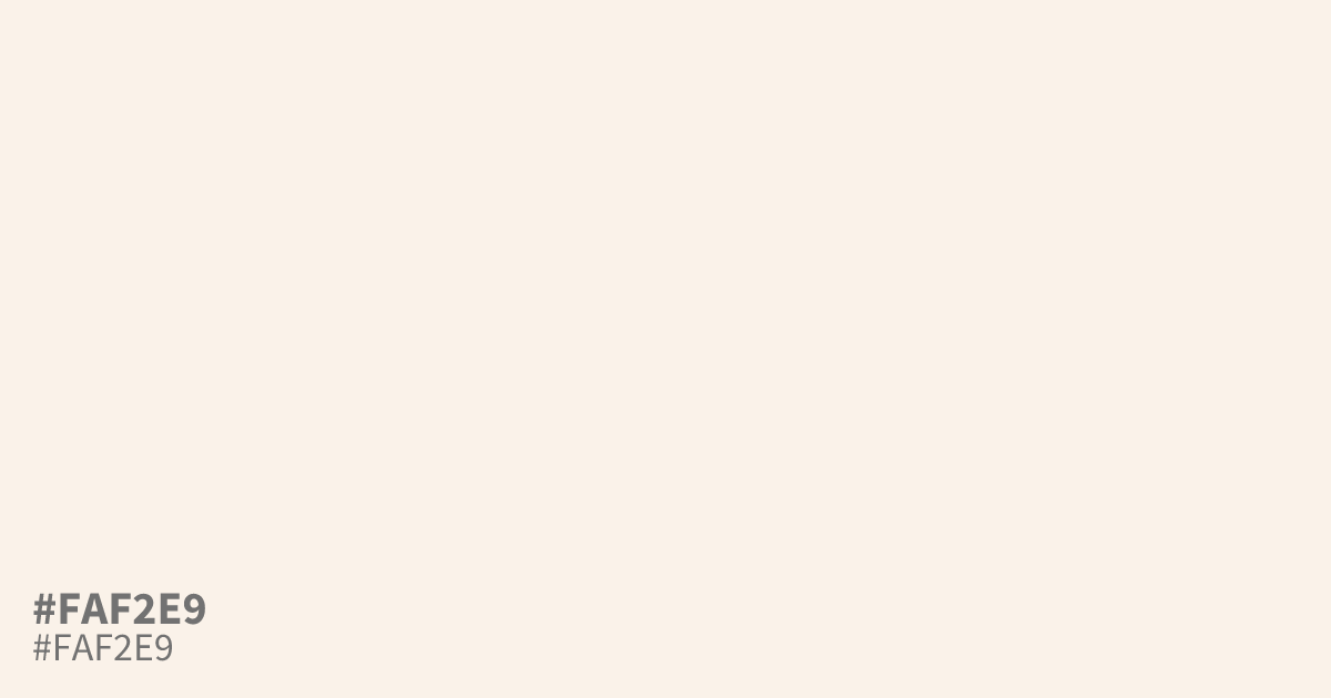
Reach for #faf2e9 when plain white feels too stark on packaging, editorial layouts, or food branding. This near-neutral cream carries a faint orange undertone, adding warmth without stealing attention. It works best as a dominant background, and black text reads clearly on it at about 18.9:1 contrast, well past WCAG AA. Pair it with terracotta or deep olive for depth.
Questions about #faf2e9
What is #faf2e9 in RGB, HSL and CMYK?
In RGB, #faf2e9 is rgb(250, 242, 233), in HSL hsl(32, 63%, 95%) and in CMYK 0%, 3%, 7%, 2%.
What colors pair well with #faf2e9?
Terracotta and deep olive bring out its warm undertone, while charcoal keeps the palette grounded. Avoid pale grays next to it, since they can look washed out by comparison.
Is #faf2e9 readable on white or black?
#faf2e9 has a 1.10:1 contrast ratio on white and 18.94:1 on black. WCAG asks for 4.5:1 for body text and 3:1 for large text, so on white it is too faint for text and on black it works for body text. Try other pairs in the contrast checker.