
#E7E6DF Hex Color
Online color picker to view shades, tints, color codes, and complementary colors
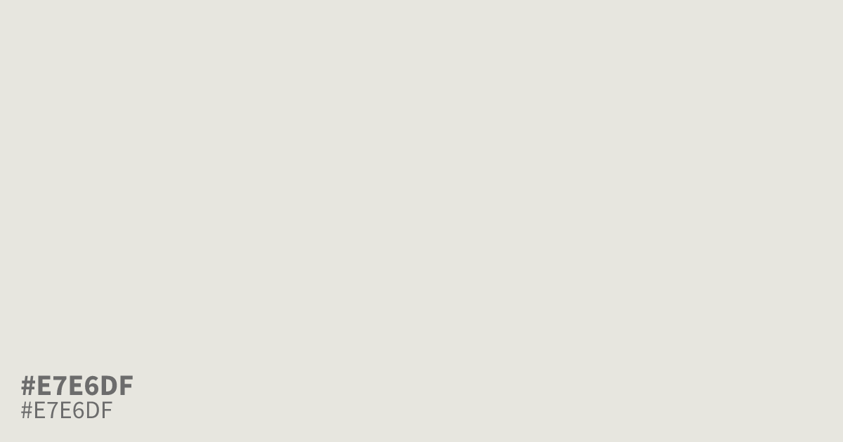
This pale, bleached grey has a slight warm, earthy undertone that prevents it from feeling sterile. Because it sits so close to white, #e7e6df works best as a calm, airy background for UI interfaces or minimalist design layouts. Black text provides excellent readability against this shade, allowing for clean typography. Avoid using it next to pure white, as it can appear muddy by comparison.
Questions about #e7e6df
What is #e7e6df in RGB, HSL and CMYK?
In RGB, #e7e6df is rgb(231, 230, 223), in HSL hsl(53, 14%, 89%) and in CMYK 0%, 0%, 3%, 9%. Browse more shades of gray with names and hex codes.
How should I use #e7e6df in web design?
#e7e6df functions best as a soft, neutral background color that allows dark typography to stand out clearly. It provides a more approachable, organic feel than stark white, making it ideal for minimalist layouts that need a gentle, sophisticated foundation.
Why does #e7e6df look muddy next to pure white?
Because #e7e6df carries a warm, earthy yellow undertone, placing it directly adjacent to pure white highlights its tint, making the grey appear slightly dingy by comparison. It is best to use this color as your primary surface rather than a secondary element against white.
Is #e7e6df readable on white or black?
#e7e6df has a 1.25:1 contrast ratio on white and 16.78:1 on black. WCAG asks for 4.5:1 for body text and 3:1 for large text, so on white it is too faint for text and on black it works for body text. Try other pairs in the contrast checker.