
#E6E6F0 Hex Color
Online color picker to view shades, tints, color codes, and complementary colors
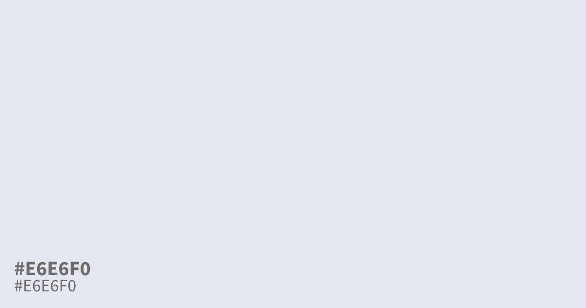
An almost-gray violet, #e6e6f0 is pale, low-saturation, and lightly luminous. Its bleached purple undertone gives interfaces an airy, delicate feel without the starkness of white. Use the hex code #e6e6f0 as a spacious UI background or supporting tone beside charcoal, ink navy, or muted plum. Black text reads clearly on it, including small body copy.
Questions about #e6e6f0
What is #e6e6f0 in RGB, HSL and CMYK?
In RGB, #e6e6f0 is rgb(230, 230, 240), in HSL hsl(240, 25%, 92%) and in CMYK 4%, 4%, 0%, 6%. Browse more shades of gray with names and hex codes.
Does #e6e6f0 read as warm or cool?
#e6e6f0 reads as a cool, pale violet because its blue channel is slightly higher than its red and green channels, giving it a faint lavender cast rather than a neutral gray appearance.
What colors pair well with #e6e6f0?
#e6e6f0 pairs well with charcoal, ink navy, and muted plum, which give its pale violet base enough contrast and warmth; use charcoal for readable text, navy for a polished interface, or muted plum for a softer layered palette.
Where can I use #e6e6f0 in a design?
#e6e6f0 works well as a spacious UI background, card surface, or supporting panel when you want a soft, airy foundation that avoids the stark look of pure white in calm layouts. Its low saturation keeps accent colors in focus, and black text provides strong contrast.
Is #e6e6f0 readable on white or black?
#e6e6f0 has a 1.23:1 contrast ratio on white and 16.94:1 on black. WCAG asks for 4.5:1 for body text and 3:1 for large text, so on white it is too faint for text and on black it works for body text. Try other pairs in the contrast checker.