
#DBCCBC Hex Color
Online color picker to view shades, tints, color codes, and complementary colors
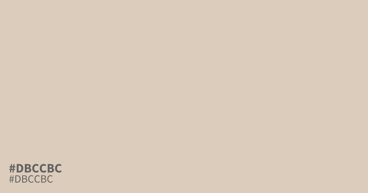
#dbccbc is a pale, muted orange with beige-gray undertones and a soft, bleached finish. Its lightness creates an airy sense of delicacy, cleanliness, and optimism without feeling stark. Use this hex code as a spacious background or supporting tone in food packaging and autumn branding. Black text reads clearly, while white can wash out against it.
Questions about #dbccbc
What is #dbccbc in RGB, HSL and CMYK?
In RGB, #dbccbc is rgb(219, 204, 188), in HSL hsl(31, 30%, 80%) and in CMYK 0%, 7%, 14%, 14%. Browse more shades of gray with names and hex codes.
Does #dbccbc read as a warm or cool color?
#dbccbc reads as a warm, pale orange because its beige-gray base retains subtle yellow-orange warmth, even though the gray reduces saturation and keeps it from feeling stark or highly saturated. It suits airy, gentle designs.
What text color works best on #dbccbc?
#dbccbc works best with black or very dark text, which provides stronger contrast than white on its light surface and keeps lettering easier to read in layouts, labels, and interface elements. Check the final combination with an accessibility contrast tool.
What colors pair well with #dbccbc?
#dbccbc pairs well with charcoal for strong dark contrast, muted terracotta for a warm autumn palette, and sage for a softer natural scheme that keeps the overall look grounded without adding harsh brightness.
Is #dbccbc readable on white or black?
#dbccbc has a 1.57:1 contrast ratio on white and 13.37:1 on black. WCAG asks for 4.5:1 for body text and 3:1 for large text, so on white it is too faint for text and on black it works for body text. Try other pairs in the contrast checker.