
#DBC7B3 Hex Color
Online color picker to view shades, tints, color codes, and complementary colors
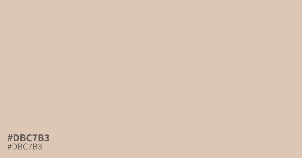
This pale, desaturated orange feels like weathered sand or bleached parchment. With its airy and delicate quality, #dbc7b3 functions as a perfect neutral base for minimalist layouts. Because of its high lightness, it holds black text with excellent clarity. Use this hex code as a background color to ground bright, saturated accents, as it often looks washed out when paired with other pastels.
Questions about #dbc7b3
What is #dbc7b3 in RGB, HSL and CMYK?
In RGB, #dbc7b3 is rgb(219, 199, 179), in HSL hsl(30, 36%, 78%) and in CMYK 0%, 9%, 18%, 14%. Browse more shades of gray with names and hex codes.
What colors pair well with #dbc7b3 in a design?
Is #dbc7b3 readable on white or black?
#dbc7b3 has a 1.63:1 contrast ratio on white and 12.83:1 on black. WCAG asks for 4.5:1 for body text and 3:1 for large text, so on white it is too faint for text and on black it works for body text. Try other pairs in the contrast checker.