
#D0BDAA Hex Color
Online color picker to view shades, tints, color codes, and complementary colors
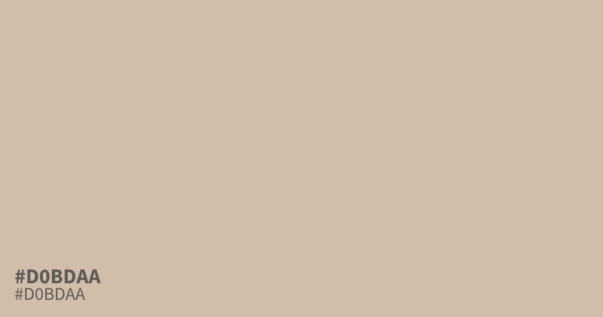
A pale, faded orange with beige and ashy gray undertones, #d0bdaa has low saturation and generous lightness. Its delicate, airy character suits warm minimalism, open-space layouts, food packaging, and autumn themes. Use it as a dominant background with dark text, though white can wash it out. The hex code #d0bdaa provides about 11.5:1 contrast with black.
Questions about #d0bdaa
What is #d0bdaa in RGB, HSL and CMYK?
In RGB, #d0bdaa is rgb(208, 189, 170), in HSL hsl(30, 29%, 74%) and in CMYK 0%, 9%, 18%, 18%. Browse more shades of gray with names and hex codes.
Does #d0bdaa read warm or cool?
#d0bdaa reads warm overall because its muted orange-beige base outweighs the slight gray cast, though the low saturation keeps it restrained rather than sunny. Nearby blue-gray colors can make its warmth more noticeable.
What colors pair well with #d0bdaa in a palette?
#d0bdaa pairs well with charcoal or muted olive, which add needed depth without overpowering its low-saturation warmth; terracotta can provide a stronger autumn accent when the design needs more energy.
Where does #d0bdaa work best in a layout?
#d0bdaa works best as a dominant background or spacious surface, especially in minimal, food, and autumn-themed designs where its pale warmth supports content without demanding attention from headlines or imagery.
Is #d0bdaa readable on white or black?
#d0bdaa has a 1.81:1 contrast ratio on white and 11.54:1 on black. WCAG asks for 4.5:1 for body text and 3:1 for large text, so on white it is too faint for text and on black it works for body text. Try other pairs in the contrast checker.