
#CCC2B3 Hex Color
Online color picker to view shades, tints, color codes, and complementary colors
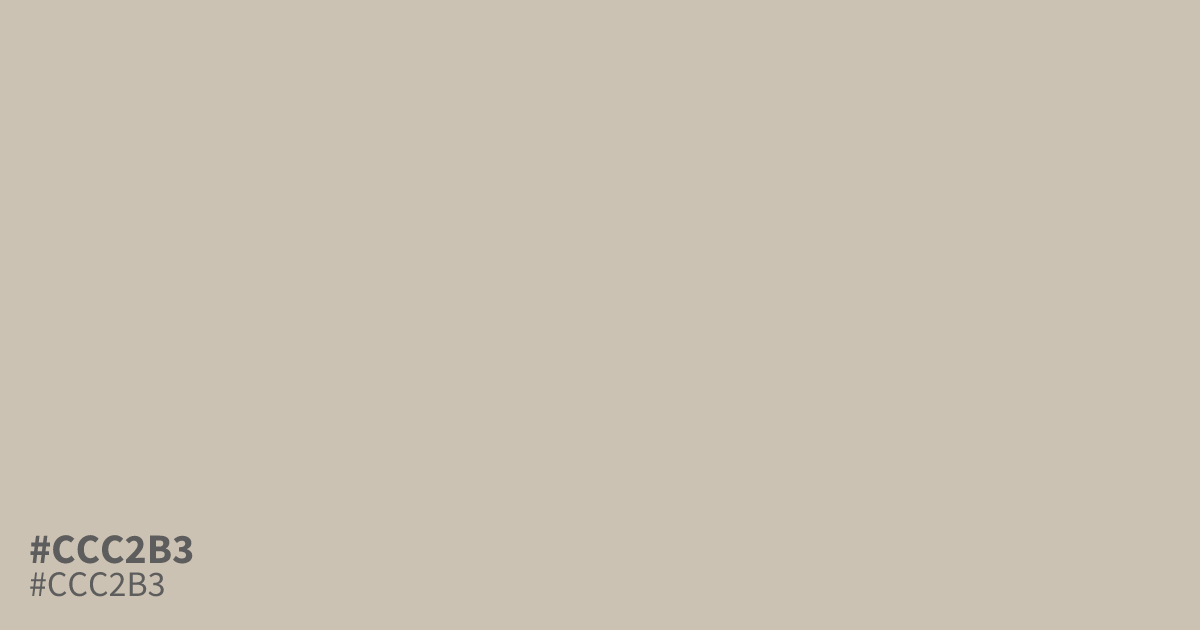
#ccc2b3 is a pale, low-saturation orange beige with ashy gray undertones. Its light, faded surface gives layouts an airy, delicate feel, making it useful as a dominant background in interiors, stationery, and luxury packaging. Pair it with charcoal or dark olive for definition, since it can look washed out beside white. Black text reads clearly on it. The hex code is #ccc2b3.
Questions about #ccc2b3
What is #ccc2b3 in RGB, HSL and CMYK?
In RGB, #ccc2b3 is rgb(204, 194, 179), in HSL hsl(36, 20%, 75%) and in CMYK 0%, 5%, 12%, 20%. Browse more shades of gray with names and hex codes.
What colors pair well with #ccc2b3?
#ccc2b3 pairs well with charcoal, dark olive, and other deep muted tones because its pale, low-saturation beige needs stronger contrast to add definition and prevent layouts from looking washed out. Black text provides strong readability, while white text may not offer enough contrast for accessible body copy.
Does #ccc2b3 look warm or cool?
#ccc2b3 reads as a warm, pale beige because its orange base is softened by ashy gray undertones, creating a restrained neutral that feels gentler and less yellow than many cream or tan shades. It can bring warmth to a space without appearing strongly golden.
Where does #ccc2b3 work best in design?
#ccc2b3 works best as a dominant background for interiors, stationery, editorial layouts, and luxury packaging, where its airy, faded surface supports a quiet look without competing with typography or imagery. Pair it with dark accents to keep the composition defined.
Is #ccc2b3 readable on white or black?
#ccc2b3 has a 1.75:1 contrast ratio on white and 11.93:1 on black. WCAG asks for 4.5:1 for body text and 3:1 for large text, so on white it is too faint for text and on black it works for body text. Try other pairs in the contrast checker.