
#AFA7A1 Hex Color
Online color picker to view shades, tints, color codes, and complementary colors
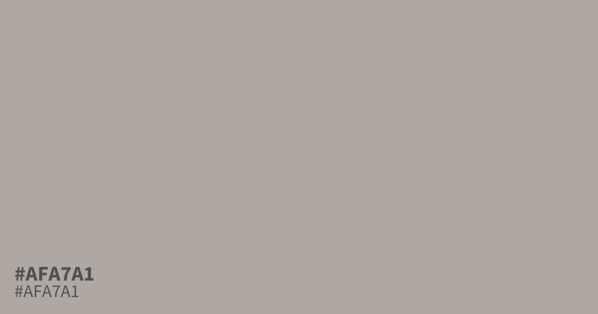
Driftwood comes to mind. #afa7a1 is a shade of orange pulled so far toward gray that it reads as a warm greige. Its low saturation and mid lightness keep things calm, which makes it a solid supporting tone behind deeper colors like teal or charcoal. It can look muddy at large scale, so treat it as a 30 rather than a 60. Black text holds up well on it, reaching about 8.9:1 contrast, past the 4.5:1 needed for WCAG AA body copy. The hex code suits autumn palettes, packaging, and youth brands that want warmth without noise.
Questions about #afa7a1
What is #afa7a1 in RGB, HSL and CMYK?
In RGB, #afa7a1 is rgb(175, 167, 161), in HSL hsl(26, 8%, 66%) and in CMYK 0%, 5%, 8%, 31%. Browse more shades of gray with names and hex codes.
What colors pair well with #afa7a1?
Deep teal, burnt sienna, and charcoal all sit well against #afa7a1, since its muted warmth flatters colors with real depth. Crisp white can wash it out, so lean on darker partners when you need contrast.
Is #afa7a1 a safe background for text?
Yes, with dark type. #afa7a1 reaches about 8.9:1 contrast against black, well past the 4.5:1 required for WCAG AA body copy. White text falls short, so keep lettering dark on this shade.
Is #afa7a1 readable on white or black?
#afa7a1 has a 2.36:1 contrast ratio on white and 8.86:1 on black. WCAG asks for 4.5:1 for body text and 3:1 for large text, so on white it is too faint for text and on black it works for body text. Try other pairs in the contrast checker.