
#ADA39E Hex Color
Online color picker to view shades, tints, color codes, and complementary colors
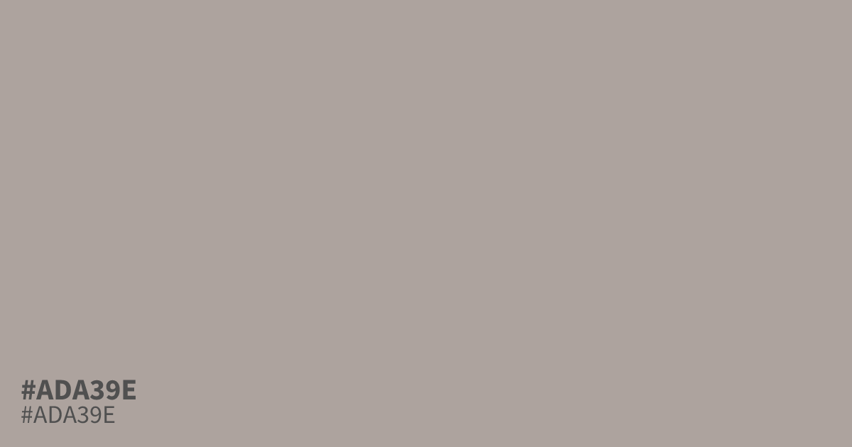
Not the bright orange its hue family suggests. #ada39e is a dusty, grayed shade that reads closer to warm taupe, with just enough orange underneath to keep it from feeling cold. That low saturation makes it a strong supporting tone or background rather than a lead color, and it flatters deep navy or charcoal accents better than bright whites. For accessibility, black text on #ada39e reaches about 8.5:1 contrast, well past the WCAG AA 4.5:1 threshold for body text. The hex code #ada39e suits autumn palettes, muted branding, and food packaging where soft warmth matters.
Questions about #ada39e
What is #ada39e in RGB, HSL and CMYK?
In RGB, #ada39e is rgb(173, 163, 158), in HSL hsl(20, 8%, 65%) and in CMYK 0%, 6%, 9%, 32%. Browse more shades of gray with names and hex codes.
What colors pair well with #ada39e?
Deep, saturated colors bring out its hidden warmth. Try navy or charcoal for contrast, olive for an earthy palette, or cream for a soft autumn feel. Avoid pale whites, which wash it out.
Is #ada39e readable on white or black?
#ada39e has a 2.46:1 contrast ratio on white and 8.50:1 on black. WCAG asks for 4.5:1 for body text and 3:1 for large text, so on white it is too faint for text and on black it works for body text. Try other pairs in the contrast checker.