
#857A69 Hex Color
Online color picker to view shades, tints, color codes, and complementary colors
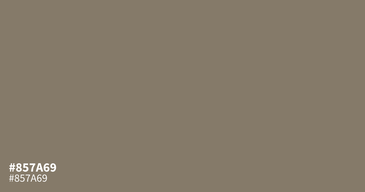
This muted, ashy orange tone acts as a reliable neutral that leans toward grey. Because #857a69 is so desaturated, it avoids looking too bright, making it a stable choice for background areas. It pairs well with charcoal or soft cream to create a grounded, professional look. Since black text provides a 5.0:1 contrast ratio against this hex code, it remains perfectly legible for small body type.
Questions about #857a69
What is #857a69 in RGB, HSL and CMYK?
In RGB, #857a69 is rgb(133, 122, 105), in HSL hsl(36, 12%, 47%) and in CMYK 0%, 8%, 21%, 48%. Browse more shades of gray with names and hex codes.
Why is #857a69 a good choice for professional background design?
#857a69 offers a stable, muted presence that avoids visual fatigue while maintaining excellent legibility for black text. Its desaturated, ashy quality provides a grounded foundation for professional interfaces, allowing stronger accent colors or typography to stand out without competing for attention.
Which color combinations work best with #857a69?
Pair #857a69 with charcoal or deep navy for a grounded, high-contrast look that feels modern and structured. If you prefer a softer, warmer aesthetic, using it alongside a rich cream or a muted terracotta creates a balanced, sophisticated palette for branding.
Is #857a69 readable on white or black?
#857a69 has a 4.21:1 contrast ratio on white and 4.98:1 on black. WCAG asks for 4.5:1 for body text and 3:1 for large text, so on white it works only for large text (24px, or 18.5px bold) and on black it works for body text. Try other pairs in the contrast checker.