
#7EE8C9 Hex Color
Online color picker to view shades, tints, color codes, and complementary colors
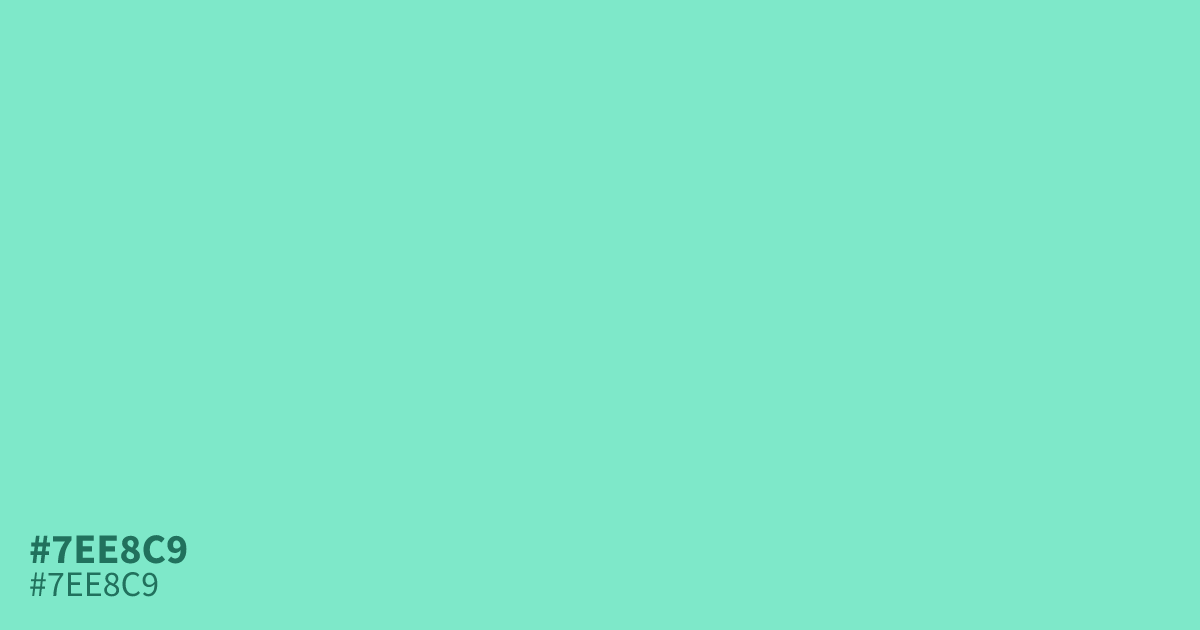
Soft as sea glass, this pastel teal reads cool and unsaturated because of its high lightness. #7ee8c9 works well as a background or supporting tone in wellness and healthcare layouts, where black text stays readable at roughly 14.3:1 contrast. It does wash out next to white, so anchor it with deeper partners like navy or muted grays from mixing gray.
Questions about #7ee8c9
What is #7ee8c9 in RGB, HSL and CMYK?
In RGB, #7ee8c9 is rgb(126, 232, 201), in HSL hsl(162, 70%, 70%) and in CMYK 46%, 0%, 13%, 9%.
What colors pair well with #7ee8c9?
Deep navy, charcoal, and terracotta all balance the lightness of #7ee8c9. Its low saturation also accepts muted grays without turning muddy, so it layers easily into a 60/30/10 palette.
Where does #7ee8c9 work best in a design?
Use #7ee8c9 as a dominant background or supporting tone in healthcare, wellness, and spring-themed work. It is too light to carry fine white detail, so treat it as a base under dark text rather than an accent.
Is #7ee8c9 readable on white or black?
#7ee8c9 has a 1.47:1 contrast ratio on white and 14.27:1 on black. WCAG asks for 4.5:1 for body text and 3:1 for large text, so on white it is too faint for text and on black it works for body text. Try other pairs in the contrast checker.