
#7ED3B1 Hex Color
Fresh and airy high-chroma pastel green
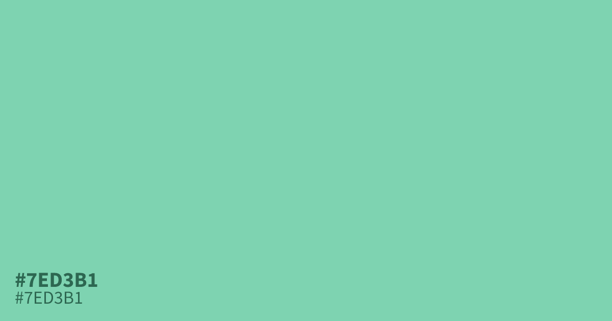
This high-chroma pastel green feels fresh and airy due to its pale, unsaturated base. Because #7ed3b1 offers such high contrast with black text, it performs best as a UI background or a branding accent for wellness and tech apps. Avoid pairing it with harsh neons, as it quickly loses its soothing character. This hex code provides a polished, clear alternative to traditional mint tones.
Questions about #7ed3b1
What is #7ed3b1 in RGB, HSL and CMYK?
In RGB, #7ed3b1 is rgb(126, 211, 177), in HSL hsl(156, 49%, 66%) and in CMYK 40%, 0%, 16%, 17%.
How should I use #7ed3b1 in a digital interface?
#7ed3b1 serves as an ideal background color for clean, wellness-focused interfaces because it maintains high contrast with dark text. Use it sparingly as a primary accent button or subtle card background to keep the interface feeling open and airy.
Which color combinations work best with #7ed3b1?
Pair #7ed3b1 with charcoal for high-contrast accessibility or complement it with soft peach tones to emphasize its warm, organic undertones. Avoid pairing it with harsh, saturated neons, which can overwhelm the delicate, fresh balance of this specific green shade.
Is #7ed3b1 readable on white or black?
#7ed3b1 has a 1.77:1 contrast ratio on white and 11.83:1 on black. WCAG asks for 4.5:1 for body text and 3:1 for large text, so on white it is too faint for text and on black it works for body text. Try other pairs in the contrast checker.