
#7B6E85 Hex Color
Online color picker to view shades, tints, color codes, and complementary colors
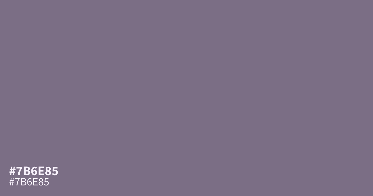
Dusty purple with a heavy gray cast, #7b6e85 sits mid-dark and very muted. It works best as a supporting tone behind white text, which clears AA at about 4.8:1 contrast. Pair it with sage green or warm terracotta to lift its ashy undertone. Across large background areas it can read muddy, so give it a job rather than the whole canvas.
Questions about #7b6e85
What is #7b6e85 in RGB, HSL and CMYK?
In RGB, #7b6e85 is rgb(123, 110, 133), in HSL hsl(274, 9%, 48%) and in CMYK 8%, 17%, 0%, 48%. Browse more shades of gray with names and hex codes.
What colors pair well with #7b6e85?
Pair #7b6e85 with sage or muted terracotta for an earthy, low-contrast palette. Cream and warm off-whites flatter its gray undertone better than pure white, which can make it look washed out.
Is #7b6e85 readable on white or black?
#7b6e85 has a 4.76:1 contrast ratio on white and 4.41:1 on black. WCAG asks for 4.5:1 for body text and 3:1 for large text, so on white it works for body text and on black it works only for large text (24px, or 18.5px bold). Try other pairs in the contrast checker.